
LIGHTING PRINCIPLE THREE: THE COLOR OF LIGHT
We see light usually as a white source, or at least a neutral source.
It isn’t. neutral, it has a color to it and that color can influence all the parts of your image, from shadows to highlights. We don’t see the color of light because our brain changes it to a neutral “white” color as we see it.
Here is a wonderful article that explains the way that the color of light affects your image. Read it now.
When we look at the color of the scene in front of us we can change it globally by changing our color balance in the camera, or using a filter. What “globally’ means is that everything in the photo is changed to the same setting. All the colors are altered by this global change to the color of the light.
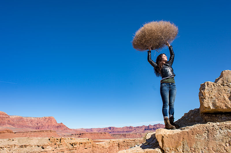
On the left is a photograph taken near Mable Canyon. The sun was quite bright, and there was a bit of warmth to the image because of all the warm browns and oranges of the topography all around us.
This image is as shot. I have applied global changes to the color of the light source so you can see what that does to the image.
Below from left to right:
Daylight / Shade / Tungsten / Flourescent
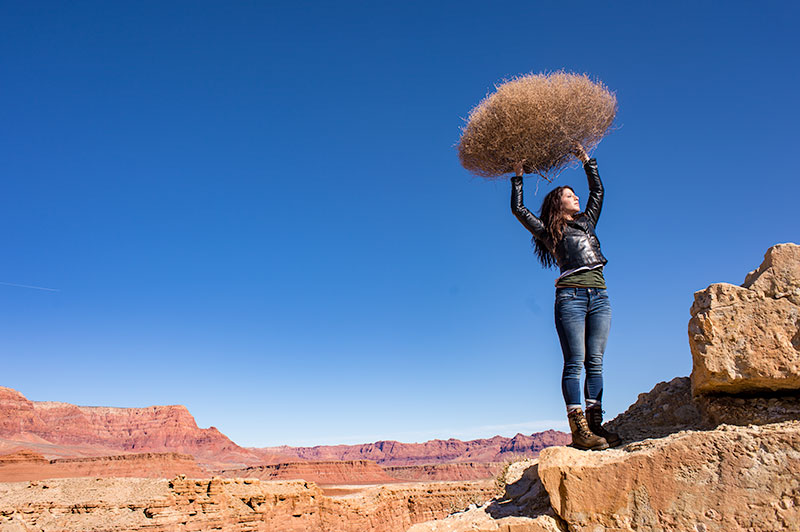
DAYLIGHT
Changing from As Shot to Daylight shows very little difference, although the daylight color balance makes it a bit more warm.
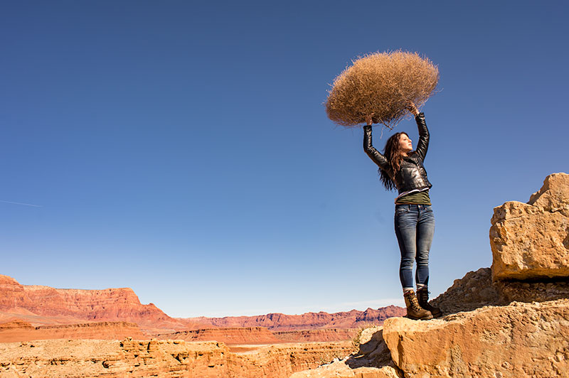
SHADE
Since the color of the light in the shade is a bit more blue, we add some warmth to the overall image to compensate for it. In this shot you can see the global warmth is not going to work because the image was not shot in the shade.
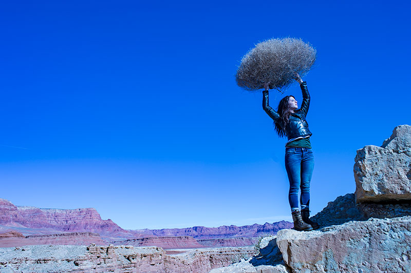
TUNGSTEN
Tungsten light is very orange, so when we apply a tungsten color balance to a shot that is not too orange, we get this very blue looking shot. This is a good reminder of just how ‘warm’ tungsten light is if it takes this much blue to make it correct.
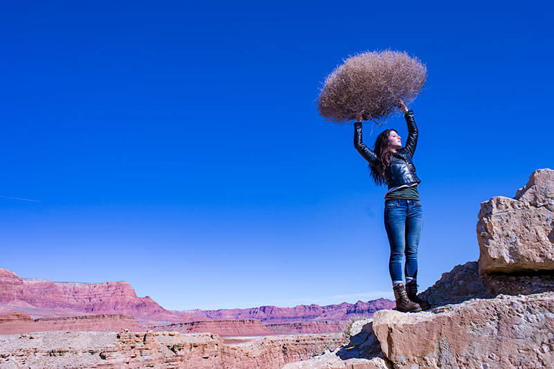
FLUORESCENT
Fluorescent light is blue/green so it makes it difficult to compensate for. In this application of the fluorescent color balance, we can see the sky going a deep blue, while the desert mountains behind become more magenta.
LOCAL LIGHT SOURCE MATCHED TO AMBIENT
Working with a secondary light source that may be a different color presents us with a challenge. We cannot change the image globally because adding a correction to the image to correct for the different light source will affect the entire image.
We must then change the different light source to the ambient (or overwhelming light) in order to ‘balance’ the subject in the ambient setting.
The ambient setting is the overwhelming light that we usually cannot change: the sun, a large warehouse, a home. Bringing in our own lights means we must know how to match what we bring to what is there.
ASSIGNMENTS FOR THIS CLASS:
- Using the color settings on your camera, take the same image with each of them. Shoot with Daylight, Shade, Tungsten, Flourescent at least and do this in places where those colors exist. In other words, shoot some images outside, inside with regular household lamps, and some place that has Flourescent. (NOTE: Many big box stores use a light source known as Mercury Vapor. Mercury Vapor is blue/green so it is very difficult to adequately address. We can add magenta to offset the green, but that turns the blue part of the light to purple. If we address the blue with something warm, we add that to the green part of the light.For Mercury Vapor correction, try “auto” on your camera setting. It is the best I have found for correcting most of that blue/green color shift.
- Using a strobe (speedlight), take a photograph of someone while the sun is going down behind them. Do not alter the strobe setting, just let it keep making the shot as the light turns warmer and warmer. You will then see how “blue” the light source seems coming from the flash.You may have to change the settings as the light gets dimmer, but I think you will see the changes pretty well.
We will be addressing color balance in all of the upcoming classes.

Thank You creativeLIVE: What a Great Experience
Well it was planned for a long time. We put it on the calendar back in December I believe. I couldn't speak to it until it went "live" so to speak, and the marketing push started. So I simply alluded to a certain three days that my friends and LE followers should...
Emerging Photographer Jump Start Package
NOTE: THE CONTEST IS CLOSED. WINNER WILL BE ANNOUNCED MAY 28. Winner: Catherine Johnson AND Eric Bartel. We had a tough time with the tie, so we have to go with both. I will need to hear from you two very very quickly so we can find a date and a time. NOTE: For all...
WordPress Basics for Photographers: Part One
I am a big fan of Wordpress. I love the ease of use, and the total attention to quality that the Wordpress folks apply to the changes and updates to the core product. I also love traditional websites and feel that they do have their place for photographers. But many...
A Drive Through Northern Arizona on a Sunny Day
It was a bright Friday morning as I left to go up north. I had planned on leaving a bit earlier than 8:30, but those plans were offset by the need to get my youngest to school and finish some things at the office. Sometimes the plans we make don't work out. They just...
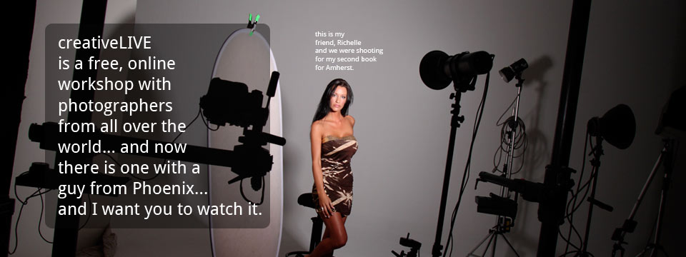
Why I Think You Should Watch My creativeLIVE Show in April
Hi, gentle readers of this blog/zine... err, whatever it is. If you have been following along for any time you know that I don't have a lot of stuff to sell, nor do I spend much time hawking how fabulously cool I am. Really. But occasionally I need to do a little...
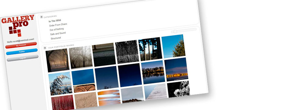
GalleryPro: A Portfolio Tool for Photographers
Back in the fall I was discussing an idea about maintaining a portfolio over multiple platforms with Scott Forman, a photographer in Omaha. Scott is also a terrific coder, as you will see. My idea has always been to make it very easy for photographers who do not have...
Shooting With “Abundance” or “Scarcity” – A Creative Choice
Do you shoot with an "abundance" mental approach? Or is your choice to shoot from a mental state of "scarcity"? It makes a difference, you know. It makes a difference in how you approach your subject matter. It makes a difference in the way you see the world. It can...
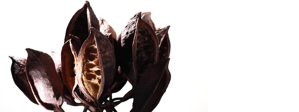
Improvisation with Pods… Lighting for Dramatic Effect
I have promised myself that I will get out and shoot more for myself this year. These "improvs" are part of the process. I limit myself to one subject and one hour. And the subjects can range over whatever happens to be near me or catch my eye. This time it was pods I...
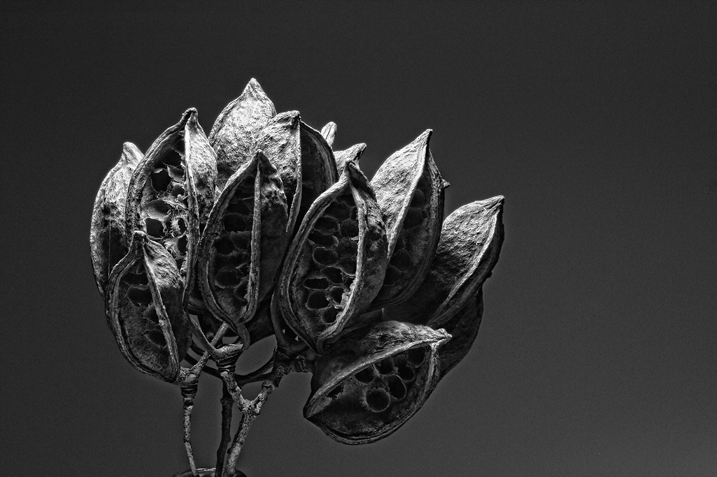
OT Sunday: Posts of Interest and Some Tunes for Fun
Occasionally we get a little off topic on a Sunday post. While this one is no exception, there are some very interesting posts from photographers I think you should check out. You may have missed them along the way, or not even known about the blogs, but they are...

Some Assignments Are Just Sweeter Than Others
And that's a fact, Jack! Over at Project 52 (www.project52.org) we did an assignment on Desserts. The job was to make a dessert shot so inviting that it fairly SCREAMED chocolate (or at least DESSERT). We had a lot of submissions. Here are twenty that caught my eye......
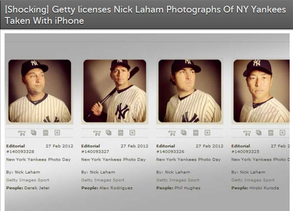
Does Culture Lead or Follow Photography? Hint – Look Up Ahead…
I think it leads it. Simply and right out there. This story on F-Stoppers has a lot of comments on it, most of them missing the point by a swing and a miss (sorry...). [Shocking] Getty licenses Nick Laham Photographs Of NY Yankees Taken With iPhone The story is about...
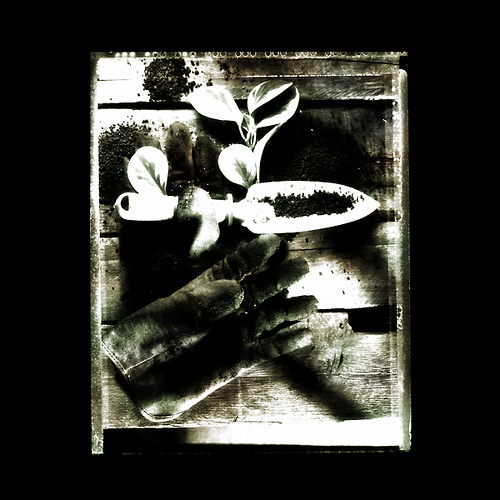
Still Life for Article on the Challenges of Home Gardening / Pesticides…
... or something like that. I don't remember the particulars on the slant of the article. Late on a Monday, the art director called in a panic with a rush job. Could I do an illustration for a publication that was going to press on Wednesday. We had to shoot it,...
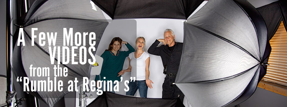
Some Fun Videos of Lighting Setups
These were quick and fun little videos I did while Regina was shooting at the one-on-one workshop she won at the Lighting Essentials Contest last winter. She has a great little studio for shooting and making great images, and with 7 lights and all kinds of modifiers...

Four Umbrella Madness: Shooting with Regina in Utah
We were having so much fun with Regina (our contest winner) in her Utah studio that I decided to do a bunch of videos of a few of the setups. (Here is Regina's blog post on the past weekend.) This one was made possible when Regina said she had four matching small...
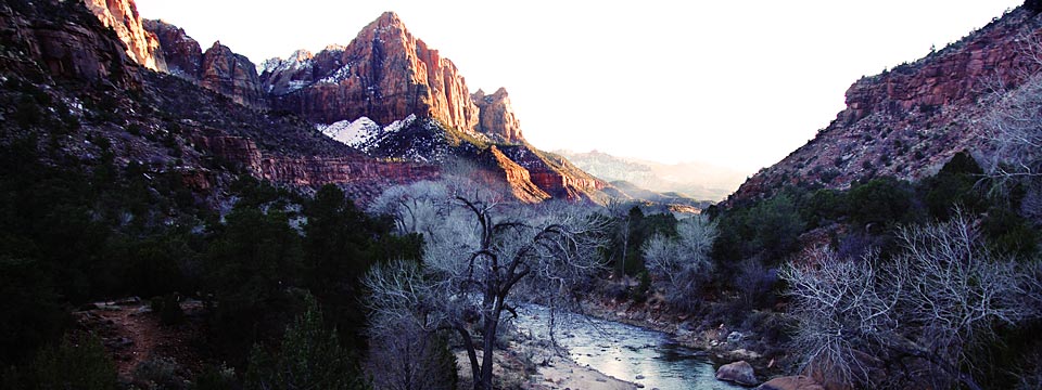
Greetings from Zion Nat’l Park – Winner’s Workshop
Hi everyone. We are here at the entrance to Zion National Park in the small town of Springdale. This is where the "Winner Gets Me" contest winner lives and where we are doing her one-on-one workshop for the weekend. She invited Megan from Phoenix to come up and do the...

Discussing “Sculpting with Light” with Photographer Rick Gayle
Rick walks us through his lighting thoughts while actually doing a shot. You can hear him discussing the thought process he uses, and you will learn a lot of great little lighting tips and tricks to make your next photograph even better. Rick's Website. Rick's Blog I...
OT Sunday: Bill Evans, Alec Soth and MindMapping
Music. I am a huge Bill Evans fan. Have loved his music from the moment I first heard it. Magical changes, incredible technique, voicings that inspired... and a hot rhythm section that always kept pushing him along. The first time I heard Bill Evans was late one night...
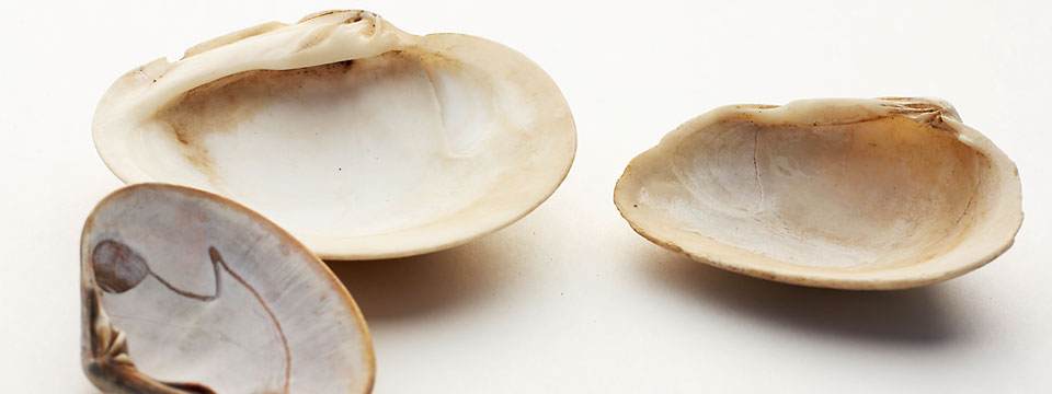
“Sea Shell” Improvisation: 1 Hour Challenge
I often say that photography is "Jazz with a camera." And I say that because I believe it to be absolutely true. A Jazz performer has to know their instrument so well, that it is second nature for them to simply play it. Jazz requires improvisation (and if it doesn't,...

Rick Gayle, Photographer: Phoenix, AZ
I have known Rick for a long, long time. I did not know that he had a blog until this morning. Funny how stuff like that goes around. Rick's blog is full of images and stories and shows a level of creativity that is rare indeed these days. I will contact Rick for a...

Miami and Key Biscayne Workshop in a Month…
I am happy to be working with Mayra and the Fotomiles Group in order to come out to Miami/Key Biscayne for a workshop. This will be a very special, limited participation workshop. Only 10 photographers and me. A full on, learn to light and master the concepts...
Hey, Hot Shot! One of My Favorite Competitions is On Now!
I first encountered Jen Bekman's project the first year it was on. I was knocked out by the level of work and would go and visit the site many times to view the work. Some of it was quite challenging, and I would look at images that were quite out of my 'zone'...
Hey… Where are you going with all that stuff?
Didja ever wonder? You got the gear. You got the lights. You got that shiny new megapixelbeast of a machine. You even have one of those latest doohickeys that everyone is drooling over. You know the one. Yeah... it's sweet. But where are you going with all that stuff?...
CreativeLIVE – Seattle – April 6, 7, 8, – Well, This Will Be Fun!
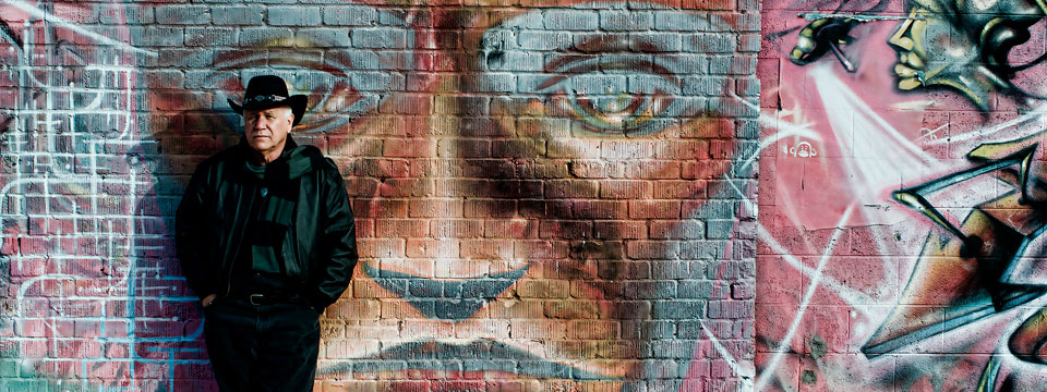
Thanks to Charles Tibbs for taking the photo. Yeah... that's me lookin' all serious and cold leaning against the back wall of my studio. Fact is, it was a bit chilly that day. Unlike today where it is pushing a bit over 70. But the weather is not the subject here - it...
OT- Sunday, #1: Darkness, Cello Madness and Jazz
Sometimes I have an opportunity to discuss other topics than photography. These times are rare, of course, but they do exist. I thought it may be fun to post some of the other things that are interesting to me on Sunday Mornings. Welcome to Off Topic Sundays, an...