
EVERYTHING REFLECTS.
Let me say that again. Everything reflects.
Some things reflect more than others. Some surfaces are more reflective than others.
But since everything reflects, we are sometimes presenting what that subject reflects rather than ‘bouncing’ light into a dark area.
In portraiture, I think of providing the shadow side of the face something to reflect back to me rather than ‘filling’ as in creating light on a dark surface. The reason is that the cheek and chin and hair on the shadow side can be made to reflect the object I have placed there if it will indeed be within the angle of reflection to my camera.
I believe I get more control that way. The brighter the ‘reflectors’ the brighter the reflections back to me. Moving the reflector away from the subject increases the distance, and the reflection becomes less bright.
One of the chief reasons that things reflect the way they do is the surface of the subject. Smooth surfaces may reflect absolutely, with lots of contrast, while adding texture will cut down on the reflection of the light and actually cause it to be presented with less contrast.
It is this nature of the subject that I focus on first when deciding what kind of light to use.
I will say this before we go on… there is NO one way or right way or best way do make images. There is your way and my way and her way and his way and on and on. I will present to you what I do and you are free to take it and modify/adjust/deconstruct/start over or discard what I do. It’s OK. In fact it is what I want you to do. Take this information and make it yours. Utilize subject centric lighting in your own way and make better photographs.
Surfaces have a couple of distinct parameters for us to explore: rough, smooth matte, shiny and combinations of all three sometimes. And each one of them reflects light back to us in different and particular ways.
Shiny, glossy surfaces, matt surfaces, and textured surfaces.
We will first look at textured surfaces.
Texture is what I see first when I start to look at a subject. I just do. Of course color and shape and all play into it, but the light has its way with texture, and I notice how it is presented back to the camera. In nature it can help me decide the angle of my camera to subject and in the studio it helps me decide on what kind of lights/modifiers I will be using.
I can choose to either enhance or mitigate texture by using the angle of the light as it is presented to the subject and back to me. A very rough wood wall with light scraping down across it shows a lot of texture, and I can use that angle of light to reveal that texture to my viewers. If I decide to lessen the contrast I can wait for a cloud to come between the sun and the subject, or go around the subject to see if there is texture wood in the shade. It will still be a texture, but it will have less contrast between the bright part of the texture detail and the shadow side.
The cloud lowers the contrast just as being in the shade does. In simple form, the light source becomes larger than the detail of the texture, but we will discuss this further in the next chapter.
If the light is on either horizon, I can change the look of the texture by changing where I put the light in relation to the subject – in relation to the camera.
Light from the side shows more texture. Light from the camera means less texture. The reason is that there is more contrast between the highlights and the shadows cast on the sidelight than there is with the light coming from the same direction as the camera. The light behind the camera actually doesn’t show shadow to the camera (angle of incidence = angle of reflection) while the sidelight throws shadows and creates contrast.
Texture shows the viewer how rough an area is, or what kind of surface they would find if they were there. It delineates the shape of details and it gives us information beyond what we would see on the surface. Old things have lots of texture from the weather or the sun. Areas that are full of texture have lots of visual energy. The eye knows that the light is playing on something that shows itself with character and charm. Cookies have to have texture, as does old barn wood. We want to see the texture in an old book as we want to see it in a pasta dish or leather jacket.
In the picture below, I am using a hard light to emphasize the texture of the pods. A small light source placed at a side angle to the pods and camera gives me highlight and shadow with very little transition between.
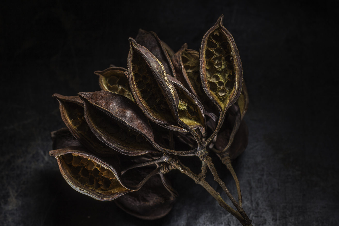
You can see the side light in the stems and the rim of light that is created by the quick fall off from reflection of the light source to the shadow.
Texture gives us context, and it is nearly unconsciously understood. We have seen what light does to texture our whole lives, so when we go to photograph it, we are naturally drawn to those times of day and places where the texture is well rendered.
But there are places where texture may not be as welcome. A subject’s face or skin may not be considered a good thing when rendered with a lot of texture. Unless, of course, they are quite interesting with the texture rendered. Age is something we can show with texture – and along with that inspiration, wisdom and the universal knowledge of what aging does to us all.
The old brick wall that Jamie is running on shows lots of texture due to the sidelight (top light) giving us edges and shadows.
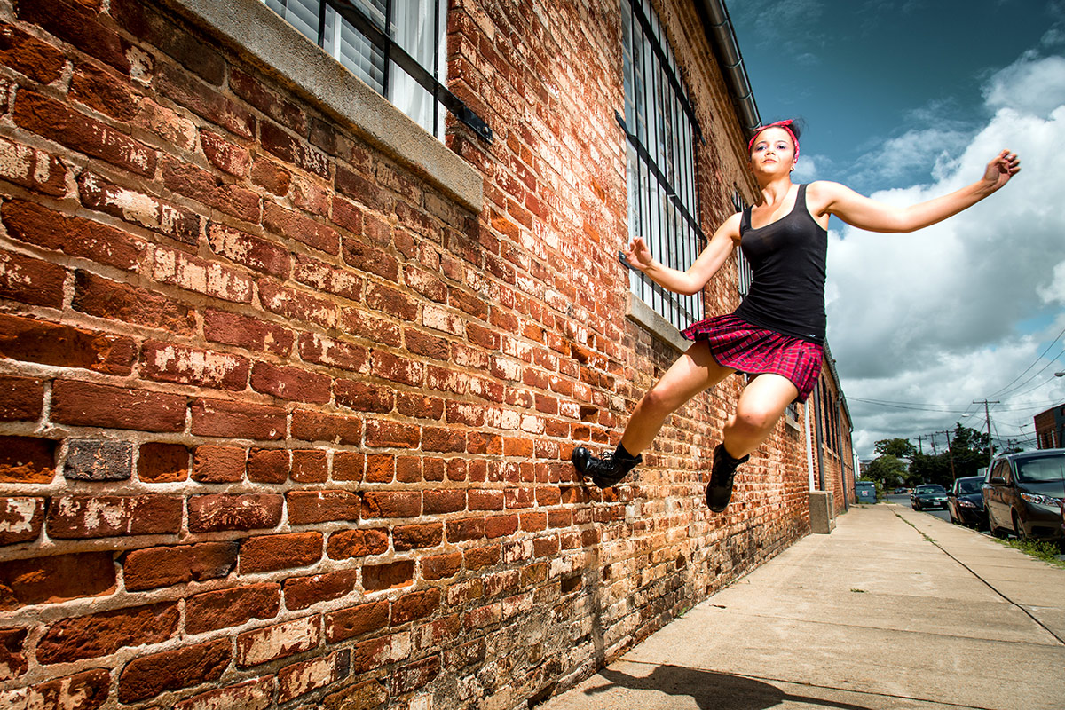
A close inspection shows us the highlights on top of the bricks and then the many indentations exacerbated by highlight and shadow with a fast fall off. This is created by using a small light source – the sun – and a large subject – the wall.
We want our things to be rendered as we expect them to be in real life. Water is wet, rough-hewn wood should look like it is a splinter waiting to happen, glassware should be very smooth, and skin should be smooth and attractive.
Sure there are examples of things being rendered in an un-natural state – and that’s fine. I am talking in a generality here, and one with a lot of history to back it up. While there may be an example of two of rough, scary skin on teenage girls, the vast majority will reject that image instantly.
This shot of cracked earth exhibits many of the properties of a subject / light relationship. Notice how much texture is shown due to the small light source side lighting the cracked earth. The sun is a small light source, and you see no soft, wrapping light, In addition, there is a bright spot in the middle of the image created by the specular – although it is a bit diffused, the dried mud is still reflective enough to show us a reflection of the sun at the same angle from camera. If I moved left or right, I would change where that bright spot was because it was locked into the same angle as my camera from the other side.
I chose to place my exposure one stop less than the recommended exposure to increase the feeling of a vignette.
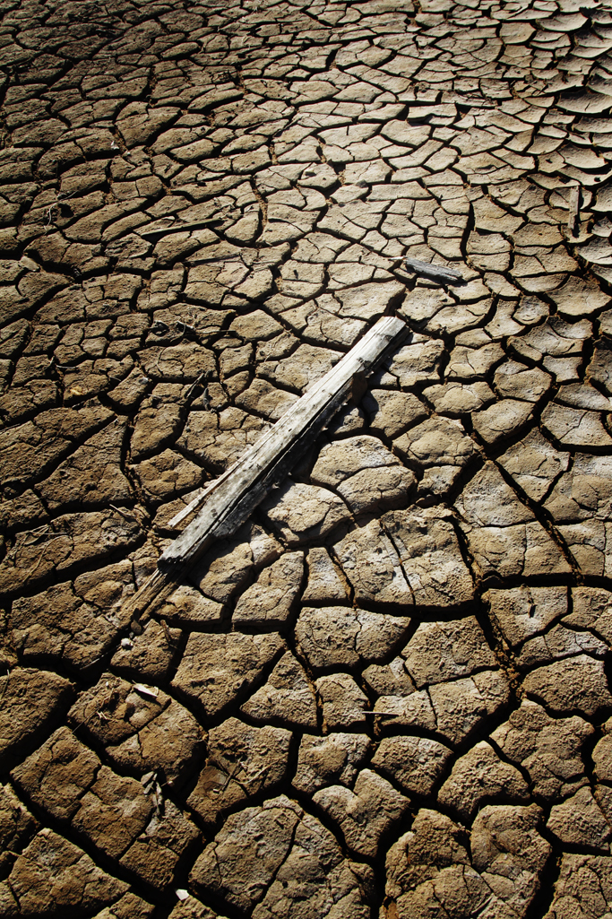
Small lightsource, at a side (back) angle and a slightly reflective surface gives us more to work with than just a dried mud slab.
Texture is also shown by the angle of incidence rule. If we choose to include the light as a part of the composition, for instance, we may choose to include its direct reflection back into the lens. A highlight on a shiny surface will show us how shiny it is by the relationship of the light and the surface around it. A less smooth surface may make a softer reflection of the light source, and that will also tell us about the surface texture.
In this detail of an alto saxophone, the light is coming from the top back and it leaves small speculars on the areas that are efficient (shiny) and emphasizes the texture of the old keys and metal discoloration.
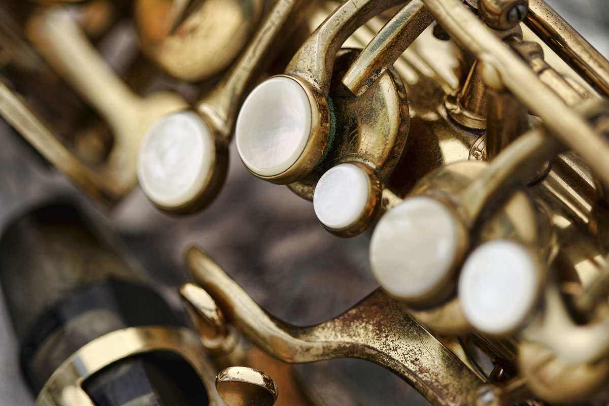
There are many places where we can use the reflection of the light source to create a cool looking gradation or highlight to create some interest as a point of composition as well.
The main point of this composition is the light on the wooden tools. By making sure the matte textured tools have a soft, directional light without any fill, the texture of the wood shows clearly in the image.

Ways to create texture:
Sidelight.
Top light.
Hard light (small source).
Backlight can also be used in many situations.
ASSIGNMENT
- Shoot a textured item (product / thing) to show the texture and find ways to mitigate or lessen the texture. Hint – front light nearly always kills texture, and sidelight nearly always makes it stronger.
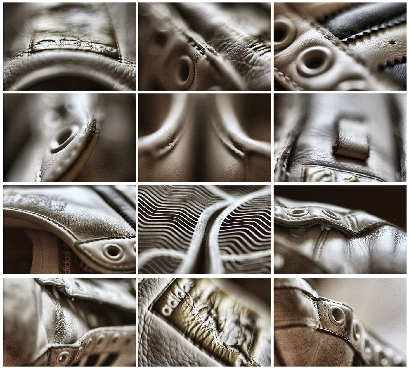
- Take a single textured item – like a shoe – and using your flashes or studio lighting, create as many different texture shots as you can using only one light – no fill.
- Look for texture in nature and shoot images that emphasize and also lessen the texture just by walking around the subject to see different angles of light to subject to camera.

Find and Keep Commercial Photography Clients: A Free Training Series.
What We Learn from Studying Master Photographers

P52 Member Adi Talwar Shooting for the NYT
Some Amazing Portraits from The Current Class
“Monsoons”
https://vimeo.com/mikeolbinski/monsoon2 I live where Monsoons create havoc a few months out of the year. Mike Olbinski, a photographer here in Phoenix is an amazing storm shooter, and this video he did of this past monsoon season is a killer. His video will keep you...
What Riding a Motorcycle Taught Me About Life (and Photography)
Challenging Times; A Few Ideas to Positively Impact Your Business
Here are a few ideas that I use to impact my business quickly and also help me move from a creative block. A few years ago I wrote about the things I do when given a chance to jump out and spend a little time on a project. That list is still pretty timely, so here it...
The “Dating Game”
Five Things to Share on a Wednesday
What’s It Like on a P52 Annual Meetup/Roadtrip
I could try to explain what it is like, but we had a videographer on the trip with us last time. https://www.youtube.com/watch?v=urSQqCGRKkM
Because Jerry… (and it’s Friday)

Shooting to Layout: A Point of Purchase Display
One of the most difficult parts of commercial photography is shooting to layout. A designer or art director has an approved layout, and your shot must work within the elements on the page. We see it a lot in catalog, advertising, collateral, and web oriented...
A WordPress Plugin for Photographers
Because… Natalia (and it’s Friday)
Jake Stangel on Starting Out as a Professional Photographer
Jake Stangel is one of my favorite photographers. I love the fresh way he shoots, and his no-nonsense approach to making images that reveal more than what may meet the eye in the real world. First: here is an hour talk he gave at CCA, and it is really good. (Below is...
Shooting to Layout: P52 Members are “Cooking” with heat!
The assignment was given with a "napkin" layout. A very simple sketch similar to what we get from AD's from time to time. Then the photographers got to download the layout - and shoot to that layout exactly. It is one of my favorite assignments because we get to see...
A Few More Portraits
The 8 Week Portrait Classes are now finished. I added a bonus photographer on for each of them (9 photographers per class) and this is the gallery of inspired images from the bonus photographer for the 8 Week II class, Mark Tucker. We look at the work of the...
Ten Things to Remember As You Begin Your Photographic Odyssey
Ten Things to Remember As You Begin Your Photographic Odyssey I stopped doing what I was doing and began to be a photographer one day. I had been around photographers, but I didn’t have any clue what being a "professional" really meant. I simply started out as a...
Portraits, Portraits!
More amazing portraits from the last portrait group. Just so impressed with the hard work and growth that was the hallmark of all these classes. [gallery link="file" columns="4"...
Catherine Vibert Delivers Social Media Headshots
P52 Alum and member Catherine Vibert explains the necessity of having a perfect headshot for Social Media. This kind of client centric marketing will create an interest in those needing to have the best headshots they can get. And - that is EVERYBODY on social media...
An Easy Tool for Shooting to Format
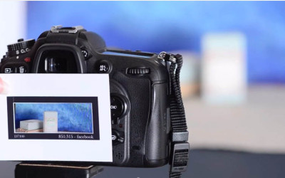
Project 52 Alums Anna and Filipe (McGunn Media) have created a set of templates (mattes) for shooting to formats that are many times required - especially by social media. They have made them available free on their site as well, so you can download them if you need...
Large Format Shooters: This Looks Really Interesting
GALAXY HYPER SPEED Direct Positive Photo Paper I love shooting large format cameras, but the hassle of developing 4x5 and 8x10 negatives can be daunting unless one has a full darkroom. Paper is easy... safelight and some trays and you got it. This project will bring...

Portraits from the Portrait Workshop
Last week we saw a bunch of amazing portraits come in from the students in the 9 Week Portrait Class 102.