
LIGHTING PRINCIPLE THREE: THE COLOR OF LIGHT
We see light usually as a white source, or at least a neutral source.
It isn’t. neutral, it has a color to it and that color can influence all the parts of your image, from shadows to highlights. We don’t see the color of light because our brain changes it to a neutral “white” color as we see it.
Here is a wonderful article that explains the way that the color of light affects your image. Read it now.
When we look at the color of the scene in front of us we can change it globally by changing our color balance in the camera, or using a filter. What “globally’ means is that everything in the photo is changed to the same setting. All the colors are altered by this global change to the color of the light.
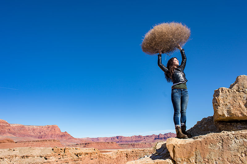
On the left is a photograph taken near Mable Canyon. The sun was quite bright, and there was a bit of warmth to the image because of all the warm browns and oranges of the topography all around us.
This image is as shot. I have applied global changes to the color of the light source so you can see what that does to the image.
Below from left to right:
Daylight / Shade / Tungsten / Flourescent
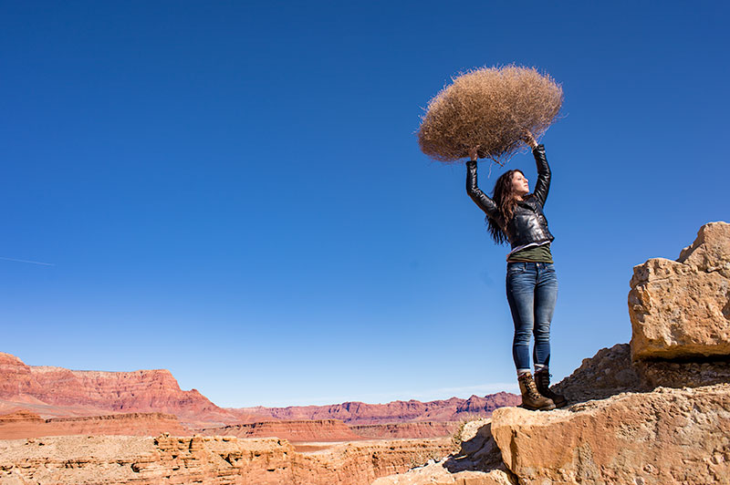
DAYLIGHT
Changing from As Shot to Daylight shows very little difference, although the daylight color balance makes it a bit more warm.
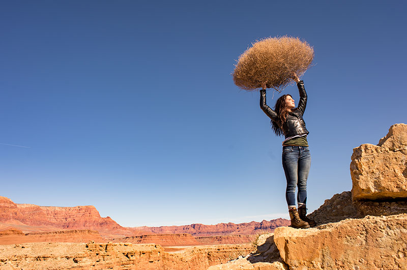
SHADE
Since the color of the light in the shade is a bit more blue, we add some warmth to the overall image to compensate for it. In this shot you can see the global warmth is not going to work because the image was not shot in the shade.
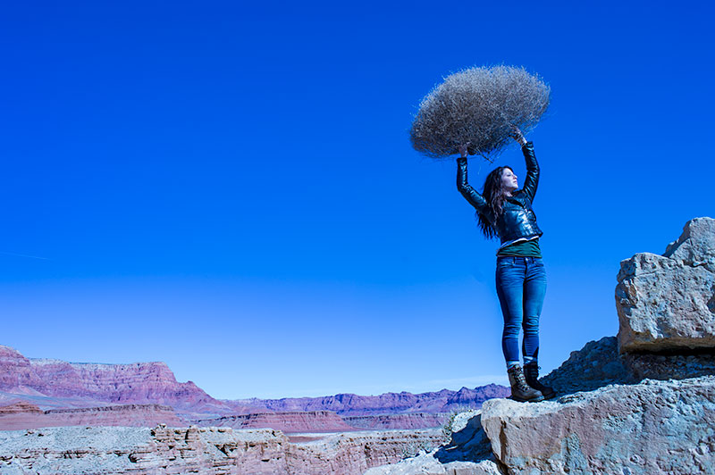
TUNGSTEN
Tungsten light is very orange, so when we apply a tungsten color balance to a shot that is not too orange, we get this very blue looking shot. This is a good reminder of just how ‘warm’ tungsten light is if it takes this much blue to make it correct.
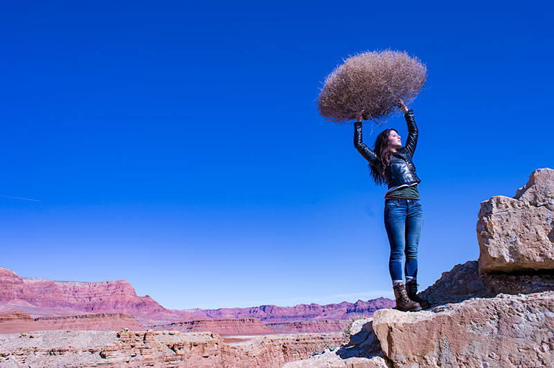
FLUORESCENT
Fluorescent light is blue/green so it makes it difficult to compensate for. In this application of the fluorescent color balance, we can see the sky going a deep blue, while the desert mountains behind become more magenta.
LOCAL LIGHT SOURCE MATCHED TO AMBIENT
Working with a secondary light source that may be a different color presents us with a challenge. We cannot change the image globally because adding a correction to the image to correct for the different light source will affect the entire image.
We must then change the different light source to the ambient (or overwhelming light) in order to ‘balance’ the subject in the ambient setting.
The ambient setting is the overwhelming light that we usually cannot change: the sun, a large warehouse, a home. Bringing in our own lights means we must know how to match what we bring to what is there.
ASSIGNMENTS FOR THIS CLASS:
- Using the color settings on your camera, take the same image with each of them. Shoot with Daylight, Shade, Tungsten, Flourescent at least and do this in places where those colors exist. In other words, shoot some images outside, inside with regular household lamps, and some place that has Flourescent. (NOTE: Many big box stores use a light source known as Mercury Vapor. Mercury Vapor is blue/green so it is very difficult to adequately address. We can add magenta to offset the green, but that turns the blue part of the light to purple. If we address the blue with something warm, we add that to the green part of the light.For Mercury Vapor correction, try “auto” on your camera setting. It is the best I have found for correcting most of that blue/green color shift.
- Using a strobe (speedlight), take a photograph of someone while the sun is going down behind them. Do not alter the strobe setting, just let it keep making the shot as the light turns warmer and warmer. You will then see how “blue” the light source seems coming from the flash.You may have to change the settings as the light gets dimmer, but I think you will see the changes pretty well.
We will be addressing color balance in all of the upcoming classes.
The Olympian Image Dust Up… Are There Lessons?
Over the weekend a 'controversy' began with a small firestorm of criticism of the images of American Athletes taken at a "media event" in Dallas. The images show cut off limbs, torn background papers, shooting off the sweep, terrible lighting and a longer list of...
Hectic Weeks, Good Friends, and New Books
It has now been a full week since I did the creativeLIVE workshop on introduction to product and still life. It was so long in the making, and then it was there. Done. The weekend before I left for Seattle, I had a huge list of things that were to be done for the...

Product and Still Life Workshop – FREE at creativeLIVE
I am making my second appearance at creativeLIVE this coming weekend. And it will prove to be something totally different than what creativeLIVE normally does. We are going to be tackling the still life and product realms. And I have a few goals and plans for this...

Commlite Enters the Trigger Market with Some Cool Features
NOTE: These triggers were sent to me to test. My TOS is clear. I do not review items that are not interesting or do not live up to my standards. If I don't like something, I do no write about it. I like these triggers. Commlite is a company based in China, I believe,...
My New WordPress Theme and Info Site
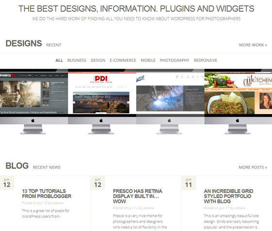
WordpressThemesForPhotographers is a new site at the URL I used for selling my WP sites. We are no longer selling those sites, but will be offering customization and initial setups of Wordpress Themes for photographers, designers, artists and small business. I will be...

OT Sunday: Hot Shots, Drums, Books and Jazz
Hey Hot Shot is a photo competition held by the Jen Bekman Gallery in New York. Featuring the work of up and coming photographers, the competition introduces new ways of seeing to an ever widening audience. It is certainly one place to go on the internet to see work...
Sorry We Were Away, Back Now… Hopefully for Good.
Looks like we had a server issue where one of my plugins was creating a huge CPU draw. The culprit was Contextual Related Posts which creates a little set of links at the bottom of each page to show you posts that may be related to the one you are reading. Problem was...
While Cleaning Up the Office, I Am Reminded of How Much I Miss Polaroid
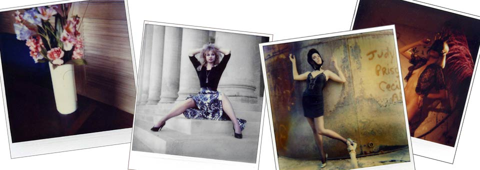
Yeah, it happens. Once in a while I have to break down to clean the office. I find it is a great way to procrastinate from doing something that is not ready yet. Creative block - no problem... dig through the cabinets. Heh. This time I found my little box of...

OT Sunday: Travel, Freedom, Politics, and Donna Summer
Travel I simply love to travel. I want to do it much more. I am adding to my travel portfolio by doing some traveling this year just for portfolio work. On the agenda is: Vancouver and Western Canada, Toronto and Eastern Canada, Singapore, Malaysia, Cambodia, South...

Staying Involved and Staying Visible… Are You?
Photo District News has a great two part article on where art buyers are finding new talent. Consider it an absolute must to read... and take some time to hit ALL the links. There are many places we all know about... Flickr, 500Pixels, Yahoo, G+. And participation...
Emerging Photographer “Jump Start” Winner(s)
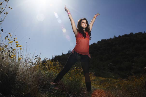
Update Info: We will be having dinner Friday evening at 7PM at Macayo's which is not very far away. If we need multiple cars, we will arrange it. Macayo's is a landmark restaurant in Phoenix and is where the Chimichanga was invented. Yes, it is Mexican food. I have...

The Black and White Portrait
I am an old school film guy. It's true. It's also true that I have embraced and love digital. Seems to me that photography gained a whole new set of tools with the addition of digital. Of course, many folks treat everything they do as some sort of 'team' affiliation...
Memorial Day, 2012. Some Thoughts.
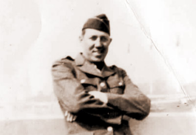
Memorial Day... always comes on a Monday. The all important three day weekend. Sales on mattresses and big screen TV's. Beach, sun, the start of summer. I am rather quiet on these days. You see, there is another reason for this holiday. Long forgotten in the lowered...
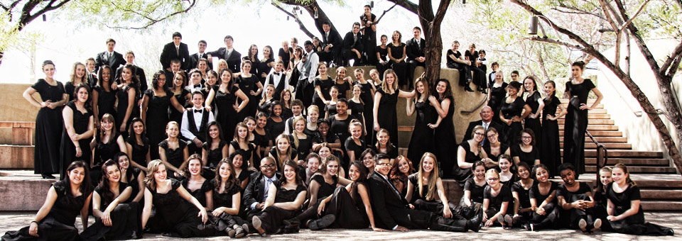
Seat-o-the-Pants Shooting… Yeah, It Happens.
I am working on a big project with the Phoenix Children's Choir, and need to get some new shots of the kids and the choirs and the performances. So when last weekend's final concert came along, I knew I had to get some shots. The venue was amazing, and I checked it...
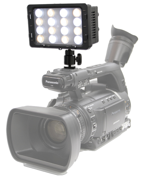
The “Bolt” – Small LED Packs a Punchy Light.
The "Bolt" LED light for photographers. LED lights are becoming more and more important as a tool for photographers. We are adding video and motion to our solutions, and continuous light that has color control as well as being able to run 'cool' is a great tool. This...
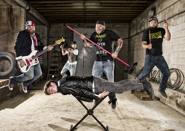
Some Exceptional Images from the Project 52 PRO Group
Project 52 is in its second year, and we added a PRO group. This group is focused on getting up to speed on the business, portfolio, website and marketing focus needed to go professional. Whether that professional is full time, part time or just for the fun of getting...
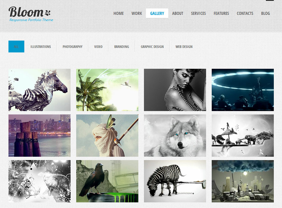
WordPress Themes that Rock: “Bloom”
I love this theme from Theme Forest. Bloom could be just what you are looking for. Clean, neat, responsive and full of custom features. This is a theme that would be a comfortable fit for a photographer, a designer or an illustrator. It would work for a small boutique...

creativeLIVE Workshop: “Table Top Product”
The great folks up at creativeLIVE produce new learning experiences for photographers, designers, illustrators and more. Their plan of delivering focused, intensive learning that is student centric instead of geography or school centric, is bold and, I think,...
WordPress Basics for Photographers: Part Four
One of the most powerful gifts of using Wordpress is the vast amount of Plugins and tools that are developed for it. These tools help you increase your productivity and interactivity without having to learn how to code. Simply push a button and install very powerful...
WordPress Basics for Photographers: Part Three
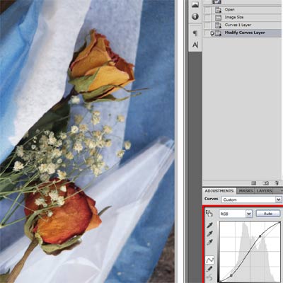
Once we have our theme worked out, we must get our materials ready. I suggest doing this before you start to build your Wordpress website. Flying by the seat of your pants is NOT the best way to organize your material, as well as write it, design it and get it into...
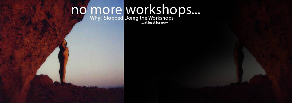
Workshops? A New Direction… After a Break. Maybe.
It's time. Actually it may be later than that. And that makes it all the more... more... Well, I don't really know how I feel about stopping the workshops. A little sad, I suppose. Possibly a tiny bit bitter (fuckit, I'm human... right?). But mostly I feel like I...
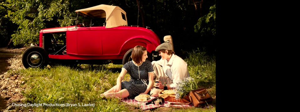
A Project 52 Assignment: Lunch
This was a most incredible assignment over at Project 52. Based on a single layout, supplied to the photographers, they had to complete a faux assignment from an ad agency that was representing a Pharmaceutical Company. The point of the ad was to show how a new pill...

Thoughts On A Couple of Portraits
I was asked about my portraiture by a reader who wanted to know what I am thinking about when shooting. I decided to break down a couple of shots I did of Natalie in Seattle the Sunday after my creativeLIVE presentation. We were on the waterfront and the sun was out...
WordPress Basics for Photographers: Part Two
(Finding your Wordpress Theme should not be taken lightly. I think you should spend some time getting to know what it will do for you before you pull the trigger.) Continued from Wordpress Basics for Photographers: Part One We have looked around and found a few themes...