I was asked if there was some sort of list of things I look at or think about before I click the shutter?
There is. I used to have a checklist that included “was the film loaded correctly” and “are the dark slides clean” and such.
We don’t do that anymore, but there is still a long list of things that I think about as I am making a photograph. And like anything we all do again and again we become much faster at processing these questions. Some of these happen so fast I don’t really ‘think’ about them. Others are non-hierarchical – which means there is no order to how they are thought through. And some are dependent on choices made before or after.
But there they are in a list… one that is not meant to be hierarchical. I am sure I could add many more, but this list is pretty basic to what I do.
> OVERALL
Correct horizon. It can either be straight or obviously tilted. A tiny tilt just looks wrong.
Is this the best placement of horizon?
Tangents.
Perfect tangents are a problem, so too can implied or ‘near’ tangents if they are not in context.
Are there empty places in the photo (composition) – we need to know not to get rid of them, but only to approve them and NOT be surprised by them?
Contrast: Is there enough contrast in the image?
What can we do to improve it?
Contrast: is there too much contrast in the image?
What can we do to improve it
Crop room (super important in commercial)
Background.
What is it doing to enhance the image?
Foreground.
What is it doing to enhance the image?
Do I need that much background?
Do I need more background?
Do I need that much foreground?
Do I need more foreground?
Do I need that much surface?
Do I need more surface?
If the background is serving any purpose, is that purpose being met?
Is there anything in the background that should not be there or will be a problem?
Is every corner as it should be? (Always check the corners)?
If there was no subject in the photo, is the background still interesting?
Should it be?
If there was no subject in the photo, is the foreground still interesting?
Should it be?
Is the lighting on the background interesting, dramatic, or revealing, or is it static, plain, and one-dimensional?
Neither is wrong, it is just important to know the context of the images.
Is the portrait orientation the best for this image? Why?
Is the landscape orientation the best for this image? Why?
Will there be a need for correcting perspective? If yes, have you left enough room around the image to allow it to be cropped without losing the subject?
> LIGHTING
Are there specular highlights on the subject?
If yes, are they placed where I want them?
Is the specular transition from highlight to true value sharp or soft?
Will that offer the correct context for the image?
Does the specular interfere with any part of the image and make it difficult to see?
Does the specular enhance any part of the image?
Is the specular defining shape or texture? Should it be?
There is no right answer, but I need to know exactly what that light is going to do.
Are the highlights being used as a compositional element? If so, are they successful?
Does the light help the viewer see shape(s)?
And is it clear and defined?
Does the light help the viewer see dimension?
And does it read clearly in the image?
Does the light help the viewer see the texture?
And is the texture important to the context of the photograph?
Does the surface of the subject show itself with the lighting I am using?
Are the shadows deep or shallow? Is that important?
Are the shadows defining anything in the image?
Do the shadows have sharp transitions or soft transitions?
Are the shadows being used as a compositional element? If so, are they successful?
Looking at both transitions (highlight to the true value, and the true value to shadow) is that what I want for the overall look of the image?
> COMPOSITION
Is it static?
Does everything have its own place? Are they spaced correctly?
Does the space between them create a ‘hero” effect?
(One item separated by more space than the other items will result in that item looking to be ‘special’.)
Is the composition dynamic?
Does the composition create overlapping angles and serpentine lines for the viewer to follow?
Are any of the items in the composition overlapping?
If yes, are they all overlapping something?
Is anything not overlapping, and is there a reason for that?
Do I have leading lines?
Is the composition “graphic” with horizontal and vertical lines either in a perpendicular presentation or leading to a vanishing point (or two)?
Do I have serpentine interest lines?
What relationship does each item have to each other?
Is anything being hidden by something that shouldn’t be?
Are all labels straight?
Are the labels presented evenly to the camera? If not, why not? Is that OK?
Are the things that line up – lined up? Perfectly?
If not, does that add interest to the image?
Does any lined up item seem to dominate the composition?
Is that what you want?
Things that need to be straight, need to be straight.
Is the angle working from a framing standpoint?
Do tall things look tall or do they look squatty?
Is there a better way to present the subject?
Does the POV enhance the look of the subject?
Does the POV show anything that is not relevant to the image? Is this OK?
Does the POV show anything that is relevant to the image? If so, does it work?
Would a Tilt-Shift lens allow you to use a better POV?
> DoF
Why did you pick the DoF that you are using for this image?
Is it a shallow DoF?
Is it a deep DoF?
Is the focus too shallow? If yes, why?
Is the focus too deep? If yes, why?
How does the focus affect the main subject?
How does the focus affect the background?
How does the focus affect the foreground?
Is focus an issue?
How could a different focus point alter the photo?
Would it be better to focus stack the image?
Would a different lens help with any of the focus issues you may encounter?
> The Shot Surprises
Elements: Are they straight, clean, lit, and generally looking great?
Are there elements that are making visuals we did not intend? (Like a ‘face’, or a horse?)
Check all four corners (again) with a very discerning eye. If things fall apart in an otherwise great image, it is often in one of those damned corners.
NOTE: I did not get into color correction, or various other things that may or may not be useful for every shot. You can add any additional items you wish. We also did not discuss preparation for the post-processing of the image.
If you would like a copy of this checklist, you may download and print these documents for your personal use.
The Photographer’s Checklist WORD DOC.
The Photographer’s Checklist PDF
Written and posted by Don Giannatti
Please credit me if you use this document.
Changing Levels and Why Plateaus Are Dangerous
I started photography a long time ago. Longer than many of you, and not as long as some of you, but it was back when motor drives cost $5K, and we only printed black and white. On Fiber. Much of what I learned then has sustained me for decades, and I loved every...
Project 52, 2011 Edition, Comes to An End
Last evening critique for Project 52, 2011 Edition. Tonite was a special night. It was a year ago that we had our first meeting and what a year it has been. Some who started with us left for reasons of life and love. A few just evaporated into the ethos… and that was...

Project 52 Photographer Greg Kindred
Meet Greg Kindred. "I found project 52 January 3, 2011 as I read about the project I knew immediately that I would participate. As the assignments were given out I was challenged right away with photographing a stranger. Pros shoot strangers every day, but in my...
Project 52 Assignment Three is Posted
Assignment Three is a simple still life shot. "First – there is a difference between product shots and still life. Product shots show, well, products – tech or cooking utensils or cameras. A still life can be made up of items that are not for sale, but instead are...

Project 52 PRO Launched Today. Building a Business in Photography
Project 52 started last year as a way for photographers to get critiques and assignment in a real world setting. In a no BS arena of commercial insight and realistic assignments. On many forums discussions range from what kind of lights do I need to the best prices on...
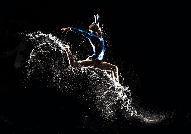
BYU Gymnastics Calendar Shoot – BTS Video
This is a great little BTS series from the good folks up at BYU. Shooting dancers and gymnast is one of my favorite subjects, and they approached this with a very unique concept... gymnasts and water. "The idea was to highlight the shapes of the gymnasts performing...