
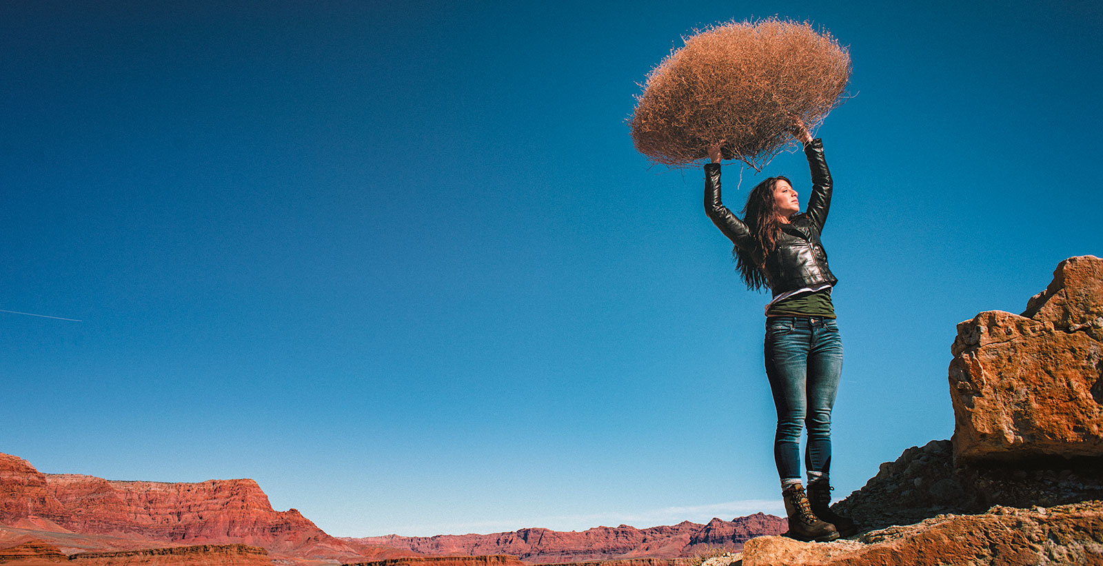
LIGHTING PRINCIPLE THREE: THE COLOR OF LIGHT
We see light usually as a white source, or at least a neutral source.
It isn’t. neutral, it has a color to it and that color can influence all the parts of your image, from shadows to highlights. We don’t see the color of light because our brain changes it to a neutral “white” color as we see it.
Here is a wonderful article that explains the way that the color of light affects your image. Read it now.
When we look at the color of the scene in front of us we can change it globally by changing our color balance in the camera, or using a filter. What “globally’ means is that everything in the photo is changed to the same setting. All the colors are altered by this global change to the color of the light.
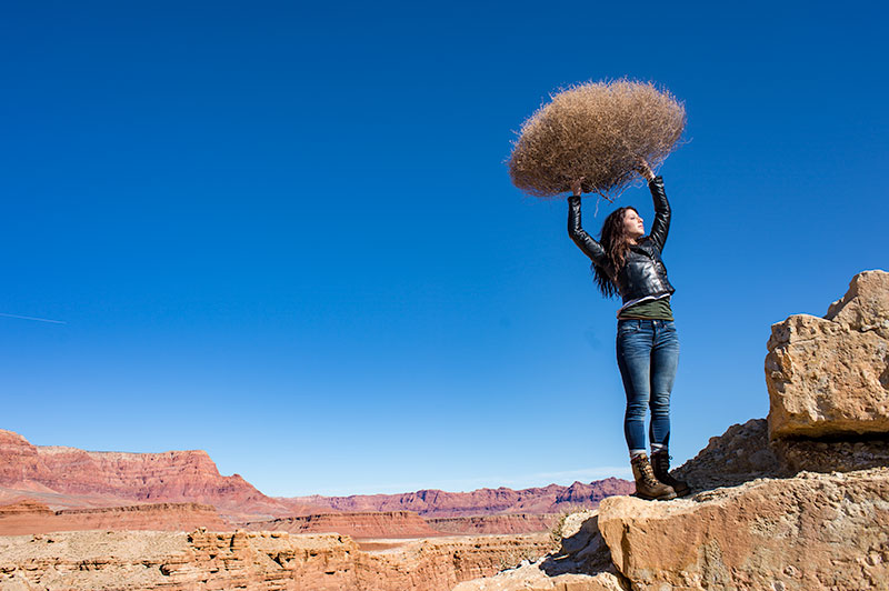
On the left is a photograph taken near Mable Canyon. The sun was quite bright, and there was a bit of warmth to the image because of all the warm browns and oranges of the topography all around us.
This image is as shot. I have applied global changes to the color of the light source so you can see what that does to the image.
Below from left to right:
Daylight / Shade / Tungsten / Flourescent
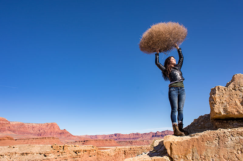
DAYLIGHT
Changing from As Shot to Daylight shows very little difference, although the daylight color balance makes it a bit more warm.
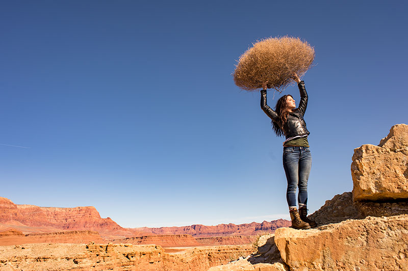
SHADE
Since the color of the light in the shade is a bit more blue, we add some warmth to the overall image to compensate for it. In this shot you can see the global warmth is not going to work because the image was not shot in the shade.
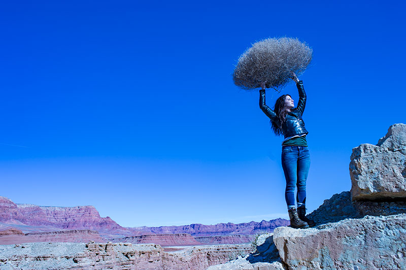
TUNGSTEN
Tungsten light is very orange, so when we apply a tungsten color balance to a shot that is not too orange, we get this very blue looking shot. This is a good reminder of just how ‘warm’ tungsten light is if it takes this much blue to make it correct.
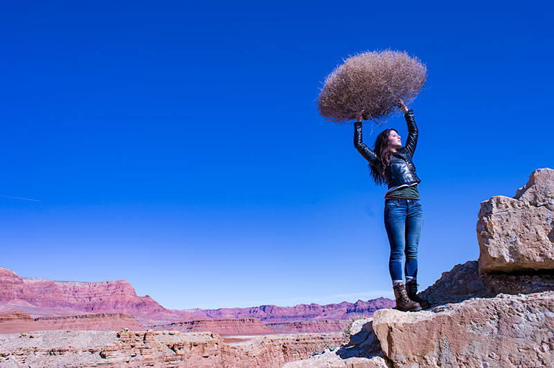
FLUORESCENT
Fluorescent light is blue/green so it makes it difficult to compensate for. In this application of the fluorescent color balance, we can see the sky going a deep blue, while the desert mountains behind become more magenta.
LOCAL LIGHT SOURCE MATCHED TO AMBIENT
Working with a secondary light source that may be a different color presents us with a challenge. We cannot change the image globally because adding a correction to the image to correct for the different light source will affect the entire image.
We must then change the different light source to the ambient (or overwhelming light) in order to ‘balance’ the subject in the ambient setting.
The ambient setting is the overwhelming light that we usually cannot change: the sun, a large warehouse, a home. Bringing in our own lights means we must know how to match what we bring to what is there.
ASSIGNMENTS FOR THIS CLASS:
- Using the color settings on your camera, take the same image with each of them. Shoot with Daylight, Shade, Tungsten, Flourescent at least and do this in places where those colors exist. In other words, shoot some images outside, inside with regular household lamps, and some place that has Flourescent. (NOTE: Many big box stores use a light source known as Mercury Vapor. Mercury Vapor is blue/green so it is very difficult to adequately address. We can add magenta to offset the green, but that turns the blue part of the light to purple. If we address the blue with something warm, we add that to the green part of the light.For Mercury Vapor correction, try “auto” on your camera setting. It is the best I have found for correcting most of that blue/green color shift.
- Using a strobe (speedlight), take a photograph of someone while the sun is going down behind them. Do not alter the strobe setting, just let it keep making the shot as the light turns warmer and warmer. You will then see how “blue” the light source seems coming from the flash.You may have to change the settings as the light gets dimmer, but I think you will see the changes pretty well.
We will be addressing color balance in all of the upcoming classes.
Interview: Jason Scott Montoya: Path of the Freelancer
I had the pleasure of interviewing Jason Scott Montoya about his upcoming book, Path of the Freelancer. The book is a deep dive into the world of freelancing. The book is available for pre-order now at Amazon. Path of the Freelancer is available in soft cover at this...
Protected: FPCN Webinar, February 25, 2017
Password Protected
To view this protected post, enter the password below:
Personal Sports Equipment: Five Examples of Lighting
The assignment was to shoot personal sports equipment (non-team sports). The photographers gave us some very nice shots, and the ways they came up with them really rock. Rainie Mills gave us a workout box with an example of its use. The key element in her image was to...
Protected: FPCN Webinar, February 18, 2017
Password Protected
To view this protected post, enter the password below:
07: Assignment Seven: An Architectural Photo of a Church
The client wants to see something special for his new PR work for a local church. The image should not have any cars in the parking lot and light MUST be on the front of the church. The client is suggesting a very early morning shot (or sunset if the light is better...
PROJECT 52 2017: A NEW BEGINNING
PROJECT 52 HAS BEEN A LAUNCHPAD FOR HUNDREDS OF PHOTOGRAPHERS OVER THE PAST 5 YEARS. THE TRADITION CONTINUES WITH A REBOOT. ENROLLMENT STARTS SOON. SIGNUP HERE FOR NOTIFICATION.
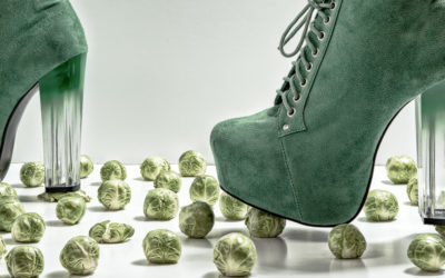
SPROUTS!!! Love ’em or hate ’em?
The assignment was to shoot Brussel's Sprouts. Anyway you want. Some people do not like Brussel's Sprouts, and some people love Brussel's Sprouts. Couldn't find anyone who was ambivalent to them. Either love 'em or hate 'em. The image above is by Karen Green who...
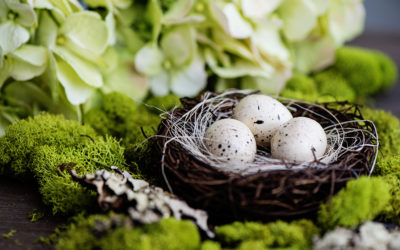
Behind the Image: Nicole Fernley
Nicole shot these images for the Still Life Class. The idea was to shoot a portrait and a landscape of the same image to see how the subject matter changes in the POV of the camera. She wanted a very soft, natural feel to the light. The photo at the top shows the...
Protected: FPCN Webinar; February 11, 2017
Password Protected
To view this protected post, enter the password below:

06: Assignment Six; A glass of wine on location
This shot cannot be done in a studio, the client would prefer it be done on location. Snow is good. Desert is good. Trees are good. It's all good because their tagline is "It's Always a Good Time for a Good Wine" (Please drink responsibly means probably not while...
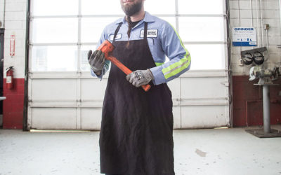
05: Assignment Five: Industrial Magazine Cover
This is a fun assignment. An art director needs a cover shot for an industrial trade magazine. Which industry? Whichever industry you choose – but it is industrial. Mechanical… build stuff! The gig can be one of three approaches. People: This shot would be a worker,...
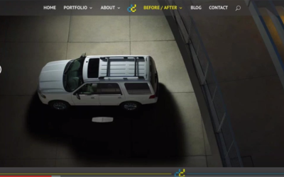
Protected: FPCN WEBINAR: JANUARY 28, 2017
Password Protected
To view this protected post, enter the password below:
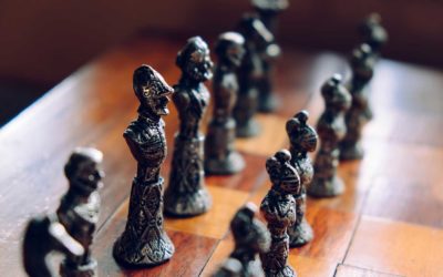
04: Assignment Four: The Game of Chess
CHESS as a Business Strategy We read about chess masters. There are movies made about chess and those who play. An esoteric, and definitively challenging game of wits and skill. Like business. Your assignment this week comes from a business magazine (Forbes, The...
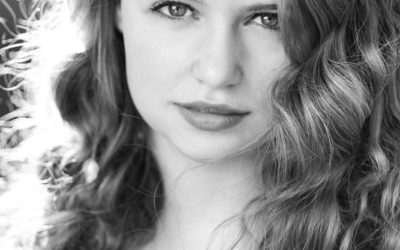
10 Black and White Portraits That Look Like Film
From some of the students in the 8 Week Black and White Class comes this selection of ten images that really look like film and paper. The assignment was to make sure the image was designed to look as though it was shot as a black and white, not simply a converted...
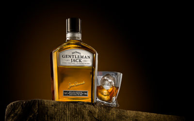
Daily Critique / Image Review: 1-17-17
This is an ongoing feature of Lighting Essentials, a Place for Photographers. We will be looking at images on a consistent basis. The images will all be work from my 8 Week Workshops or Project 52 Pros. These critiques will be short, but very informative and full of...
03: Assignment Three; Environmental Portrait
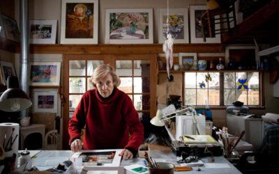
OK… time to shine. This must be a photograph in which the subject inhabits about 25% of the image. There is not much specifics to this assignment. After the difficult magazine assignment shoot, it is time to relax and make something fun. Here is a Google page of...

Daily Critique / Review
This is an ongoing feature of Lighting Essentials, a Place for Photographers. We will be looking at images on a consistent basis. The images will all be work from my 8 Week Workshops or Project 52 Pros. These critiques will be short, but very informative and full of...

Behind the Image: John Mcallister
This is a new feature on Lighting Essentials. We take a look at images and how they were made. We will be doing these posts as often as possible, and if you follow along you will get a heavy dose of instruction in lighting, composition, and the finesse of solving...

02: Assignment Two: The Incredible Egg
"THE INCREDIBLE EDIBLE EGG" Yeah... it is a popular headline, but that is what the client wants. The Design Company is located out of your area, but wants you to shoot this because you have been consistently marketing to them with great work. A local restaurant supply...
Daily Video 1
https://www.youtube.com/watch?v=4qgZiWveuBc
01: Lighting Class: Light Principle One: The Size of the Light Source
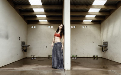
Let's look at light and the four principles of how light works. First up, the size of the light source in relation to the size of the subject. Imagine looking out the window at the front yard and without seeing the sky knowing whether it is sunny or cloudy. We do...

Assignment 1, P52 LE Edition, Portraits for Newspaper
Assignment Number One: Brief: A local newspaper has annexed an adjoining town when its newspaper folded up shop. The in-house creative at the paper wants to make a splash in the area by featuring some of its residents exclaiming happiness and joy that they can now get...
02: Lighting Class: Light Principle Two: The Distance of the Light Source
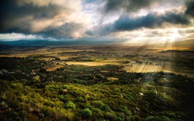
DISTANCE OF THE LIGHT SOURCE FROM THE SUBJECT The second principle of light is the distance of the light source from the subject. One thing for sure, if it is artificial light, the distance of the light source from the subject can change the size relationship, but...
“Lighthouse: Maine; A Photoshop Twist
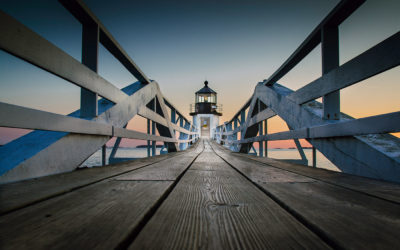
I recently rediscovered this image from a shoot I did in Maine a few years ago. I really wanted this image to work, but after trying it several times it just didn't have the snap I wanted. A few days ago, I was revisiting that shoot for a client and found the image....