
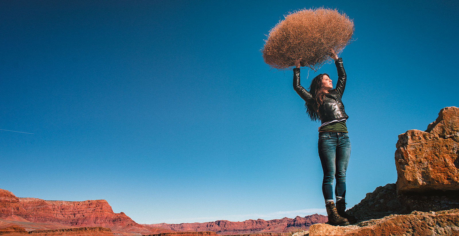
LIGHTING PRINCIPLE THREE: THE COLOR OF LIGHT
We see light usually as a white source, or at least a neutral source.
It isn’t. neutral, it has a color to it and that color can influence all the parts of your image, from shadows to highlights. We don’t see the color of light because our brain changes it to a neutral “white” color as we see it.
Here is a wonderful article that explains the way that the color of light affects your image. Read it now.
When we look at the color of the scene in front of us we can change it globally by changing our color balance in the camera, or using a filter. What “globally’ means is that everything in the photo is changed to the same setting. All the colors are altered by this global change to the color of the light.
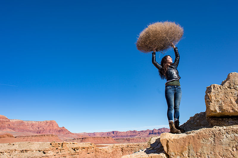
On the left is a photograph taken near Mable Canyon. The sun was quite bright, and there was a bit of warmth to the image because of all the warm browns and oranges of the topography all around us.
This image is as shot. I have applied global changes to the color of the light source so you can see what that does to the image.
Below from left to right:
Daylight / Shade / Tungsten / Flourescent
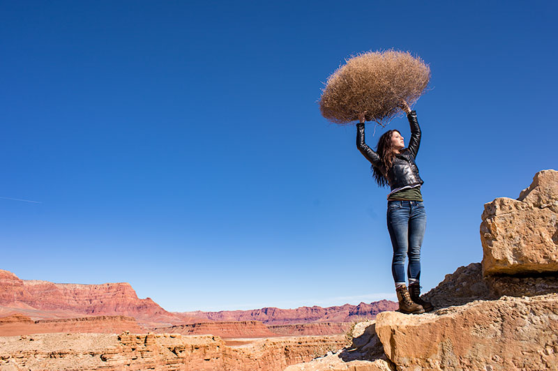
DAYLIGHT
Changing from As Shot to Daylight shows very little difference, although the daylight color balance makes it a bit more warm.
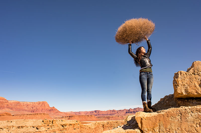
SHADE
Since the color of the light in the shade is a bit more blue, we add some warmth to the overall image to compensate for it. In this shot you can see the global warmth is not going to work because the image was not shot in the shade.
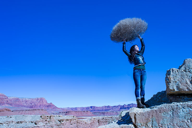
TUNGSTEN
Tungsten light is very orange, so when we apply a tungsten color balance to a shot that is not too orange, we get this very blue looking shot. This is a good reminder of just how ‘warm’ tungsten light is if it takes this much blue to make it correct.
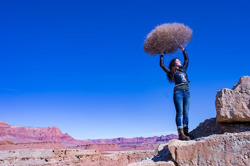
FLUORESCENT
Fluorescent light is blue/green so it makes it difficult to compensate for. In this application of the fluorescent color balance, we can see the sky going a deep blue, while the desert mountains behind become more magenta.
LOCAL LIGHT SOURCE MATCHED TO AMBIENT
Working with a secondary light source that may be a different color presents us with a challenge. We cannot change the image globally because adding a correction to the image to correct for the different light source will affect the entire image.
We must then change the different light source to the ambient (or overwhelming light) in order to ‘balance’ the subject in the ambient setting.
The ambient setting is the overwhelming light that we usually cannot change: the sun, a large warehouse, a home. Bringing in our own lights means we must know how to match what we bring to what is there.
ASSIGNMENTS FOR THIS CLASS:
- Using the color settings on your camera, take the same image with each of them. Shoot with Daylight, Shade, Tungsten, Flourescent at least and do this in places where those colors exist. In other words, shoot some images outside, inside with regular household lamps, and some place that has Flourescent. (NOTE: Many big box stores use a light source known as Mercury Vapor. Mercury Vapor is blue/green so it is very difficult to adequately address. We can add magenta to offset the green, but that turns the blue part of the light to purple. If we address the blue with something warm, we add that to the green part of the light.For Mercury Vapor correction, try “auto” on your camera setting. It is the best I have found for correcting most of that blue/green color shift.
- Using a strobe (speedlight), take a photograph of someone while the sun is going down behind them. Do not alter the strobe setting, just let it keep making the shot as the light turns warmer and warmer. You will then see how “blue” the light source seems coming from the flash.You may have to change the settings as the light gets dimmer, but I think you will see the changes pretty well.
We will be addressing color balance in all of the upcoming classes.
Sony Steps Up the Game
B&H Photo
On the Fear of Failure…
"Fear of failure for an artist, be that a photographer or creator of any kind, is deadly -it stunts growth." --McGunn Media (Anna Gunn and Filipe Martins, Portugal) on Medium.
Matt Dutile and I Discussing Editorial and Travel Photography
Take an hour and listen to Matt discuss marketing, working with magazines, finding work, keeping motivated and traveling the world making photographs for a living. Thanks, Matt! Matt Dutile, Photographer
“Too Expensive” or ‘Not Worth It” – There is a Difference
From Seth this morning: "Culturally, we create boundaries for what something is worth. A pomegranate juice on the streets of Istanbul costs a dollar, and it's delicious. The same juice in New York would be seen as a bargain for five times as much money. Clearly, we're...
Cool Shot, March 19, 2014
Photographer Andras Deme. Assignment shot for Project 52 PROS: "Time Travel". Andras used collage techniques to show the same woman in antique garments and a future wardrobe. The image was shot in London.
This Evening: Meet with Matt Dutile, Editorial and Travel Photography
Register for the free webinar here. More information here.
Are Photographers “Lonely”?
Do we think that by having a great twitter feed and a bunch of cool likes on 500pixies or GPus is the same as having buds? Friends? People to hang out with - and NOT at a keyboard while in our underwear... real interactions. I can say unequivocally that the difference...
Oh Yeah, We’ve Seen That Before…
Iconic images. You know them. The ones everyone has seen. Mather Point at the Grand Canyon. Zabriskie Point in Death Valley. Horseshoe Bend on the Colorado. The bridge over the Virgin River in Zion is one of those iconic photographs as well. A shot most everyone takes...
Michael Clark Photography: Winter Newsletter
Michael Clark's Winter Newsletter. Michael Clark's website.
Some Very Cool Footer Ideas
A well constructed footer is vital for a photographer's website. More on this subject here.
A Conversation with Matt Dutile, Travel and Portrait Photographer
Free and open to the public. Wednesday, March 19, 2014 at 6PM PST. Registration at this link. Please do not register if you cannot make the show. We have limited availability. From Matt: "Hi, I'm Matt Dutile. I'm a professional travel and portrait photographer living...
Lighting Essentials is Now a Blog
Just a short note of change here. The magazine style site is now switched to a blog page. More and shorter posts. Occasional long format posts. Back to the Essentials of Lighting Essentials.
Why I Like My Nikon Df, And Don’t Care What Others Think
Yeah, it seems strange to write an article on why in particular I really love my Nikon Df. Why would anyone give a shit what someone else likes as far as a camera? And yet, they do. And I kinda get that on some level. I have heard this camera derided as being too...

“I Could’a Been A Contender”
The assignment was to illustrate the phrase: "I Could'a Been a Contender". Taken from the Marlon Brando movie, "On the Waterfront", the phrase has been used to mean a lot of similar feelings... not making the cut, not being good enough, or being held back. The P52...
CreativeLIVE Photoshop Week
I was asked for some ideas of which shows to watch, so here is my suggestions for both beginners and power users. CreativeLIVE is bringing a ton of material to the week, and most time slots are showing two different classes. Please feel free to watch more than my...
Lighting Basics – Class Four: Inverse Square Law (Basics)
Lighting Basics: Class Four Light does the same thing every time. Read the above again, please. Because it does. Can you imagine what would happen if every time we pushed a key on a piano we got a different note? How would we make music? If 2+2 is occasionally...
Jamie at the Window
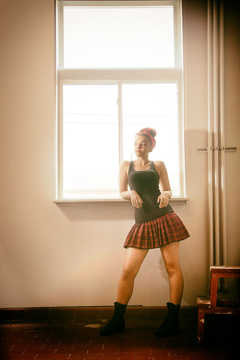
Jaimie at the Window: Fredericksburg, Virginia. I really loved the feeling of light coming in the window but the shot was very blah without the addition of a light source inside. Using a speedlight with a modifier of cards around it to give direction, I lit Jaimie...
Texture
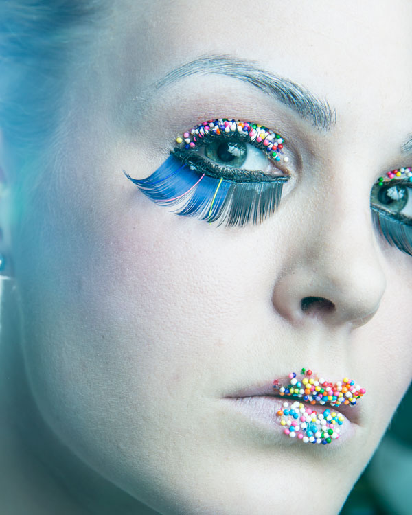
Lighting for texture is a very important part of what we do.
Understanding Reciprocals: A Basic Tenant of Exposure
Lighting Basics, Class Three I am often asked what do I decide first when making a photograph. The answer is easy... aperture. Aperture changes the way my photographs work more than any other thing. It is important to note that I am not an 'action' shooter or sports...
In Threes
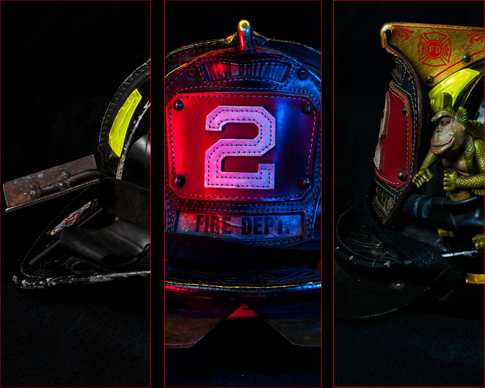
Many times in catalog or product work we are asked to shoot the same thing from different angles. This is NOT as easy as it sounds. Objects present light differently depending on shape, color, texture and dimension... and many objects have different qualities on...
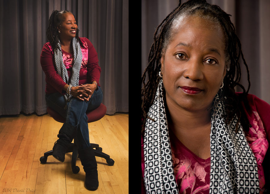
Double Portraits: David Price
Bay area photographer David Price was assigned to do a double portrait. He chose some co-workers who were happy to work with him to make the shots. It is always wonderful to have people want to work with you to make images, and David took his time to make the images...
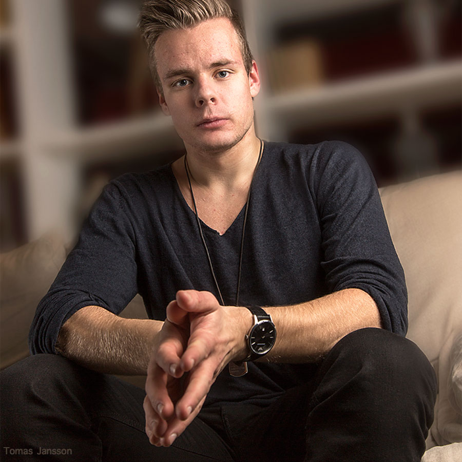
A Simple Portrait by Tomas Jansson
This portrait of a young man was shot by Tomas Jansson, Norway. Tomas used a softlighter umbrella (a bounced position umbrella with a diffusion screen over the front) for his main light, and a silver reflector for a secondary light source from camera...
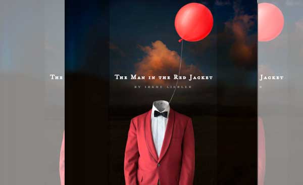
“Man In The Red Coat” – Photoshop Magic by Irene Liebler
Here is a chance to get something very cool. One of our Project 52 long time members has created a book of images from her series "The Man In The Red Coat". Irene Liebler is a photographer and designer in Connecticut and has been working on this project for a while...
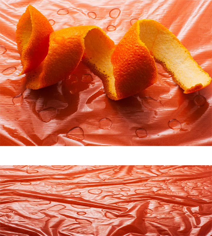
Still Life for a Water Repellent Company
The assignment was to show two images for a company that made water repellent spray. It could not have the spray in the shot, and the client wanted a second shot for the banner across the top of the website. Type and images would be placed on it, so it was to be...