
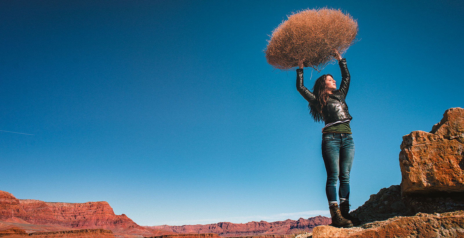
LIGHTING PRINCIPLE THREE: THE COLOR OF LIGHT
We see light usually as a white source, or at least a neutral source.
It isn’t. neutral, it has a color to it and that color can influence all the parts of your image, from shadows to highlights. We don’t see the color of light because our brain changes it to a neutral “white” color as we see it.
Here is a wonderful article that explains the way that the color of light affects your image. Read it now.
When we look at the color of the scene in front of us we can change it globally by changing our color balance in the camera, or using a filter. What “globally’ means is that everything in the photo is changed to the same setting. All the colors are altered by this global change to the color of the light.
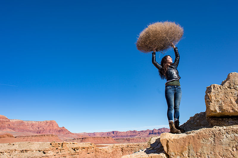
On the left is a photograph taken near Mable Canyon. The sun was quite bright, and there was a bit of warmth to the image because of all the warm browns and oranges of the topography all around us.
This image is as shot. I have applied global changes to the color of the light source so you can see what that does to the image.
Below from left to right:
Daylight / Shade / Tungsten / Flourescent
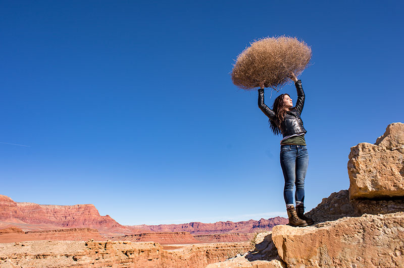
DAYLIGHT
Changing from As Shot to Daylight shows very little difference, although the daylight color balance makes it a bit more warm.
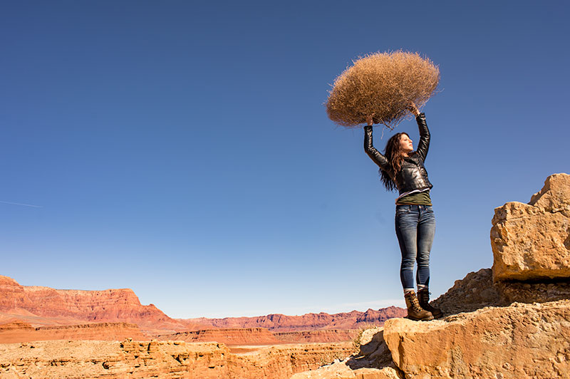
SHADE
Since the color of the light in the shade is a bit more blue, we add some warmth to the overall image to compensate for it. In this shot you can see the global warmth is not going to work because the image was not shot in the shade.
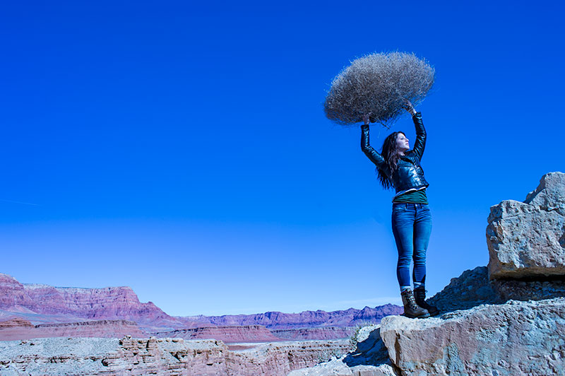
TUNGSTEN
Tungsten light is very orange, so when we apply a tungsten color balance to a shot that is not too orange, we get this very blue looking shot. This is a good reminder of just how ‘warm’ tungsten light is if it takes this much blue to make it correct.
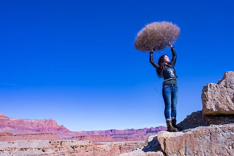
FLUORESCENT
Fluorescent light is blue/green so it makes it difficult to compensate for. In this application of the fluorescent color balance, we can see the sky going a deep blue, while the desert mountains behind become more magenta.
LOCAL LIGHT SOURCE MATCHED TO AMBIENT
Working with a secondary light source that may be a different color presents us with a challenge. We cannot change the image globally because adding a correction to the image to correct for the different light source will affect the entire image.
We must then change the different light source to the ambient (or overwhelming light) in order to ‘balance’ the subject in the ambient setting.
The ambient setting is the overwhelming light that we usually cannot change: the sun, a large warehouse, a home. Bringing in our own lights means we must know how to match what we bring to what is there.
ASSIGNMENTS FOR THIS CLASS:
- Using the color settings on your camera, take the same image with each of them. Shoot with Daylight, Shade, Tungsten, Flourescent at least and do this in places where those colors exist. In other words, shoot some images outside, inside with regular household lamps, and some place that has Flourescent. (NOTE: Many big box stores use a light source known as Mercury Vapor. Mercury Vapor is blue/green so it is very difficult to adequately address. We can add magenta to offset the green, but that turns the blue part of the light to purple. If we address the blue with something warm, we add that to the green part of the light.For Mercury Vapor correction, try “auto” on your camera setting. It is the best I have found for correcting most of that blue/green color shift.
- Using a strobe (speedlight), take a photograph of someone while the sun is going down behind them. Do not alter the strobe setting, just let it keep making the shot as the light turns warmer and warmer. You will then see how “blue” the light source seems coming from the flash.You may have to change the settings as the light gets dimmer, but I think you will see the changes pretty well.
We will be addressing color balance in all of the upcoming classes.
Inspired by Sarah Moon: 8 Week Portrait Class Student Work
This week we studied the work of Sarah Moon for inspiration. The students looked at Ms Moon's work, analyzed it, found what they liked and used it for inspiration. The goal is not to copy the masters, it is to understand them and let that understanding inspire the...
“Protectionism” is NOT The Way of Professional Photographers
The "Protectionist" Attitude Among Photographers Well, not all photographers, but a considerable few. Enough that they can make a lot of noise and bluster. I don't suffer that attitude well, never have. The whining about how there are too many photographers and how we...
Lighting Essentials Place Among Photography Blogs
Very excited to see that Lighting Essentials is the number 16 highest rated photography blog, overall. There is a whole lot of information on the page about designations for certain criteria that LE can certainly improve on. But heck... I am very happy to be up there...
Portraits Inspired by Yousef Karsh
This past week we looked at the work of Yousef Karsh. The students in the 8 Week Portrait Workshop are learning a ton and putting it to practical use. Here are their images from last weeks assignment. [gallery link="file" columns="6"...
Creating a Photo Portfolio That Represents Your Work
“What makes a photograph “Portfolio Worthy” I want to talk about what makes an image worthy of your portfolio today, and have you think about your work in possibly a different sort of way. What is your portfolio, anyway? It is the repository of the work you have made,...
6 New Books I Have Ordered
From Amazon: "W magazine is renowned for its avant-garde fashion stories, those elaborate confections of magic and mystery that have inspired and captivated readers for more than two decades. This volume gathers 10 of the most remarkable stories, each in its entirety,...
A Simple Tool for Shooting To Layout
Shooting for the web has created some interesting configured imagery. From very wide and narrow images for banners to tall and skinny images for side bars, shooting to layout is as important as ever. Here is a simple video for making a viewing tool that can help you...
Portraits Inspired by Victor Skrebneski
In the 8 week portrait class we looked at the work of famed Chicago photographer Victor Skrebneski. The students were asked to make a photograph inspired by what they saw in Skrebneski's work. Not to copy it, but to be inspired by it. Here are the remarkable expamples...
Distraction, Discontent and Distruption (Part One)
Distractions, Discontent, and Disruption The three “D’s” of the new daily discomforts. Wait, is that a fourth? We are constantly being distracted from our work, made to feel discontent at every turn and facing disruption in our business like never before....
Trends to Watch in 2015
Trends I am noticing: Social Media Thinning. Photographers are becoming more selective in where and how they spend their time in social media. This is a good thing. Not every SM platform is right for you and what you do.Facebook may be find for consumer shooters, but...
Providing Cover – Keeping Clients
Finding someone to “cover” for you on a photography assignment can be tricky business. Not just for your client, but for you AND the person who you hire to do the shoot in your place. Look, stuff happens. We all get sick or a relative passes away or there is emergency...
What I’ve Learned So Far: Thirty One; “I Love Photography… I Always Have”
{This is the final post of the "What I've Learned So Far" series and it will become a book very soon. All of you may download it for free if you are interested. I hope you enjoyed the series. I've learned more than just this, but I figured wrapping it in a month long...
What I’ve Learned So Far: Thirty; “The Overwhelming Mystique of Negativity”
"You can't do that anymore. The market is full of photographers." "Nobody is making any money in this business." "Why the hell would anyone want to go into the professional photography now, all the clients have dried up." I know. We hear that all the time. Nothing new...
What I’ve Learned So Far: Twenty Nine; “Overnight Success? I’ve Got Your Overnight Success Right Here!”
I read all about "overnight success" and usually I just smile to myself. Of course I do not believe them, but that's OK - they are always great entertainment. I remember an interview with the band "Foreigner" where the gushing interviewer mentioned their meteoric rise...
What I’ve Learned So Far: Twenty Seven; “Baggage Sucks”
What do I mean by "baggage"? I mean the crap we think about when we are making our work, the stuff that goes on between our ears that may have NOTHING at all to do with reality, but begins to weigh on us with false intentions and ruinous decisions. When I was younger...
What I’ve Learned So Far: Twenty Six; “Be Deliberate”
Be certain. Be sure. Be deliberate. Now this may sound strange coming from someone who advocates challenging everything, finding new solutions, and experimenting, but they actually go very well together. When I say be deliberate, I am talking about a process from 0 -...
What I’ve Learned So Far: Twenty Five; “Now and Then, Turn It Off”
I am writing this on Christmas Day, 2014. Not gonna do too much today. Spend time with the family, have a quiet read, and listen to some of my favorite music. There are times we must do this after long periods of stress and hyperactivity. It is our way of...
What I’ve Learned So Far: Twenty Four; “Photography is a Privilege”
Is making a photograph easy? Good question... although the question should really be; Should making a photograph be easy? We seem to expect it to be. I see the ads about how easy it is to "click" and get a picture. Kodak said it decades earlier: "Push the button and...
What I’ve Learned So Far: Twenty Three; “On Creativity”
Occasionally we run into the argument of whether or not 'creativity' can be taught, or does it have to be born within us? We read all about creativity and how important it is. We award little statuettes to really "creative" people. Creativity is blessed, cursed,...
What I’ve Learned So Far: Twenty Two; “Photography Is an Incredible Art”
Photography at its best can be a reflection of the world in ways that we have never been seen before. It is the photographer's vision that makes the image become more than it could have been. But at the heart of the photographer's vision, there is a deep foundation of...
What I’ve Learned So Far: Twenty One; “Don’t Be A Clone”
Nobody likes a clone. A clone is a copy, a non-authentic 'ringer' that has no soul, no guts, no passion, no quirks or guilts or pleasures. And it is way, way too easy to be a clone. Just copy something or someone and do that as you. But it is you. Case in point. A...
What I’ve Learned So Far: Twenty; “Gravity; A Force of Nature, Not a Way of Life”
One of the more difficult things to wrap our arms around is that not everyone out there wants us to succeed. In fact, the numbers are highly stacked against us. More people will seem to want to douse your flame of passions before it gets lit than will block the wind...
What I’ve Learned So Far: Nineteen; “It Isn’t What You Shoot, It’s HOW You Shoot What You Shoot”
In the 'business' of photography some things have changed drastically since I started out a long time ago. From "day rates" to "snip tests" some of what we did as a normal part of our creative lives have either vanished or have been recreated into some new language -...
What I’ve Learned So Far: Eighteen; “It Costs What It Costs”
Have you ever purchased a car? From a dealership? All the run around they do, the "let me take this to my manager" BS, and the "hey, what do you want to spend per month for this little honey..." makes me cringe. I am a marketer, and that stuff makes me laugh. But it...