I was asked if there was some sort of list of things I look at or think about before I click the shutter?
There is. I used to have a checklist that included “was the film loaded correctly” and “are the dark slides clean” and such.
We don’t do that anymore, but there is still a long list of things that I think about as I am making a photograph. And like anything we all do again and again we become much faster at processing these questions. Some of these happen so fast I don’t really ‘think’ about them. Others are non-hierarchical – which means there is no order to how they are thought through. And some are dependent on choices made before or after.
But there they are in a list… one that is not meant to be hierarchical. I am sure I could add many more, but this list is pretty basic to what I do.
> OVERALL
Correct horizon. It can either be straight or obviously tilted. A tiny tilt just looks wrong.
Is this the best placement of horizon?
Tangents.
Perfect tangents are a problem, so too can implied or ‘near’ tangents if they are not in context.
Are there empty places in the photo (composition) – we need to know not to get rid of them, but only to approve them and NOT be surprised by them?
Contrast: Is there enough contrast in the image?
What can we do to improve it?
Contrast: is there too much contrast in the image?
What can we do to improve it
Crop room (super important in commercial)
Background.
What is it doing to enhance the image?
Foreground.
What is it doing to enhance the image?
Do I need that much background?
Do I need more background?
Do I need that much foreground?
Do I need more foreground?
Do I need that much surface?
Do I need more surface?
If the background is serving any purpose, is that purpose being met?
Is there anything in the background that should not be there or will be a problem?
Is every corner as it should be? (Always check the corners)?
If there was no subject in the photo, is the background still interesting?
Should it be?
If there was no subject in the photo, is the foreground still interesting?
Should it be?
Is the lighting on the background interesting, dramatic, or revealing, or is it static, plain, and one-dimensional?
Neither is wrong, it is just important to know the context of the images.
Is the portrait orientation the best for this image? Why?
Is the landscape orientation the best for this image? Why?
Will there be a need for correcting perspective? If yes, have you left enough room around the image to allow it to be cropped without losing the subject?
> LIGHTING
Are there specular highlights on the subject?
If yes, are they placed where I want them?
Is the specular transition from highlight to true value sharp or soft?
Will that offer the correct context for the image?
Does the specular interfere with any part of the image and make it difficult to see?
Does the specular enhance any part of the image?
Is the specular defining shape or texture? Should it be?
There is no right answer, but I need to know exactly what that light is going to do.
Are the highlights being used as a compositional element? If so, are they successful?
Does the light help the viewer see shape(s)?
And is it clear and defined?
Does the light help the viewer see dimension?
And does it read clearly in the image?
Does the light help the viewer see the texture?
And is the texture important to the context of the photograph?
Does the surface of the subject show itself with the lighting I am using?
Are the shadows deep or shallow? Is that important?
Are the shadows defining anything in the image?
Do the shadows have sharp transitions or soft transitions?
Are the shadows being used as a compositional element? If so, are they successful?
Looking at both transitions (highlight to the true value, and the true value to shadow) is that what I want for the overall look of the image?
> COMPOSITION
Is it static?
Does everything have its own place? Are they spaced correctly?
Does the space between them create a ‘hero” effect?
(One item separated by more space than the other items will result in that item looking to be ‘special’.)
Is the composition dynamic?
Does the composition create overlapping angles and serpentine lines for the viewer to follow?
Are any of the items in the composition overlapping?
If yes, are they all overlapping something?
Is anything not overlapping, and is there a reason for that?
Do I have leading lines?
Is the composition “graphic” with horizontal and vertical lines either in a perpendicular presentation or leading to a vanishing point (or two)?
Do I have serpentine interest lines?
What relationship does each item have to each other?
Is anything being hidden by something that shouldn’t be?
Are all labels straight?
Are the labels presented evenly to the camera? If not, why not? Is that OK?
Are the things that line up – lined up? Perfectly?
If not, does that add interest to the image?
Does any lined up item seem to dominate the composition?
Is that what you want?
Things that need to be straight, need to be straight.
Is the angle working from a framing standpoint?
Do tall things look tall or do they look squatty?
Is there a better way to present the subject?
Does the POV enhance the look of the subject?
Does the POV show anything that is not relevant to the image? Is this OK?
Does the POV show anything that is relevant to the image? If so, does it work?
Would a Tilt-Shift lens allow you to use a better POV?
> DoF
Why did you pick the DoF that you are using for this image?
Is it a shallow DoF?
Is it a deep DoF?
Is the focus too shallow? If yes, why?
Is the focus too deep? If yes, why?
How does the focus affect the main subject?
How does the focus affect the background?
How does the focus affect the foreground?
Is focus an issue?
How could a different focus point alter the photo?
Would it be better to focus stack the image?
Would a different lens help with any of the focus issues you may encounter?
> The Shot Surprises
Elements: Are they straight, clean, lit, and generally looking great?
Are there elements that are making visuals we did not intend? (Like a ‘face’, or a horse?)
Check all four corners (again) with a very discerning eye. If things fall apart in an otherwise great image, it is often in one of those damned corners.
NOTE: I did not get into color correction, or various other things that may or may not be useful for every shot. You can add any additional items you wish. We also did not discuss preparation for the post-processing of the image.
If you would like a copy of this checklist, you may download and print these documents for your personal use.
The Photographer’s Checklist WORD DOC.
The Photographer’s Checklist PDF
Written and posted by Don Giannatti
Please credit me if you use this document.
“Work The Scene” with Rasmus Hald
Work the scene. Rasmus Hald One of the things that separate a good photo from a great photo is often planning, patience and how we work the scene. In July 2012 I was in Italy on vacation, driving around Tuscany in an RV and we went to Florence for a couple of days. I...
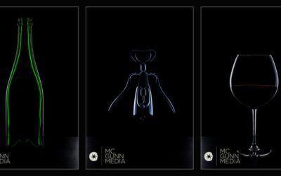
Dark Field Lighting: With McGunn Media
DARK FIELD LIGHTING: A PRIMER Anna and Filipe walk you through the making of these shots. They have a full course on shooting table top and still life work at Udemy. See more of McGunn Media's work at their website.
A Food Shot for a Blog: Daniel Fenwick
Reno Photographer Daniel Fenwick walks us through a simple, but well crafted food shot for his blog. Daniel Fenwick / website / Food Blog MANY OF THE TUTORIALS DURING "SUMMER SCHOOL" ARE BY PROJECT 52 PRO MEMBERS EITHER CURRENTLY ENROLLED OR ALUMNI.
An Interesting Negotiating Tactic
... and it is true. Names have been changed a bit to keep client/photographer privacy. I had lunch with a photographer today. We had met to go over plans for a big project and chose "The Vig" for delicious sandwiches and salads. What has that to do with the story?...
One Umbrella on Location
I am a Photoshop guy who is finding a lot of love in Lightroom. I would say that about 80% of my work goes from LR (or CR) into Photoshop for finishing. But the other 20% is done totally in Lightroom. Briana and I did this shoot last year for some new portfolio...
A Simple Tool for Shooting to Layout
Sometimes we have to shoot to specific layouts or dimensions. Here is a very simple tool for working with layouts that may not be typical. I use cardboard stock for making these little screens. And as I note on the video, I always give the shot a little breathing...