
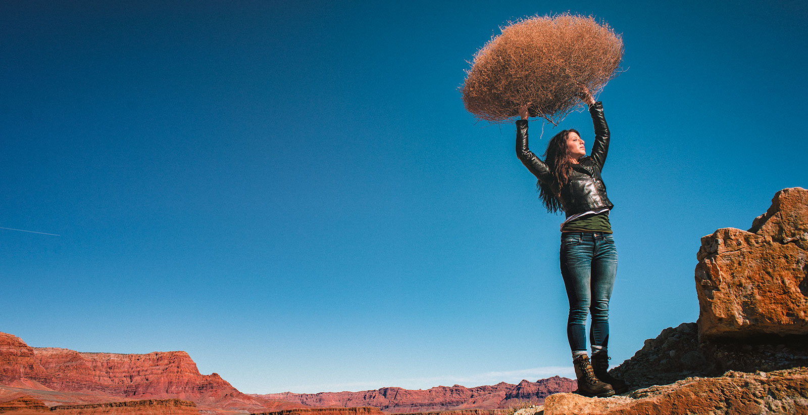
LIGHTING PRINCIPLE THREE: THE COLOR OF LIGHT
We see light usually as a white source, or at least a neutral source.
It isn’t. neutral, it has a color to it and that color can influence all the parts of your image, from shadows to highlights. We don’t see the color of light because our brain changes it to a neutral “white” color as we see it.
Here is a wonderful article that explains the way that the color of light affects your image. Read it now.
When we look at the color of the scene in front of us we can change it globally by changing our color balance in the camera, or using a filter. What “globally’ means is that everything in the photo is changed to the same setting. All the colors are altered by this global change to the color of the light.
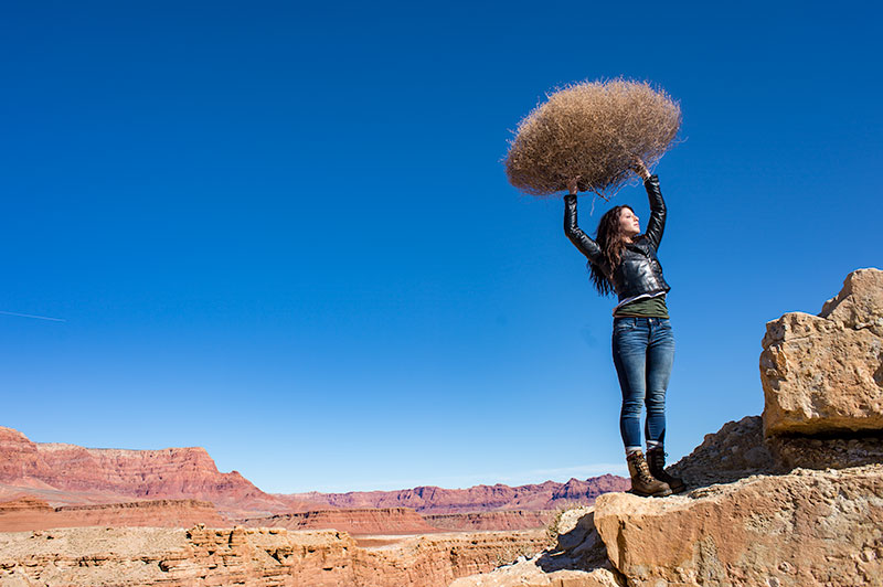
On the left is a photograph taken near Mable Canyon. The sun was quite bright, and there was a bit of warmth to the image because of all the warm browns and oranges of the topography all around us.
This image is as shot. I have applied global changes to the color of the light source so you can see what that does to the image.
Below from left to right:
Daylight / Shade / Tungsten / Flourescent
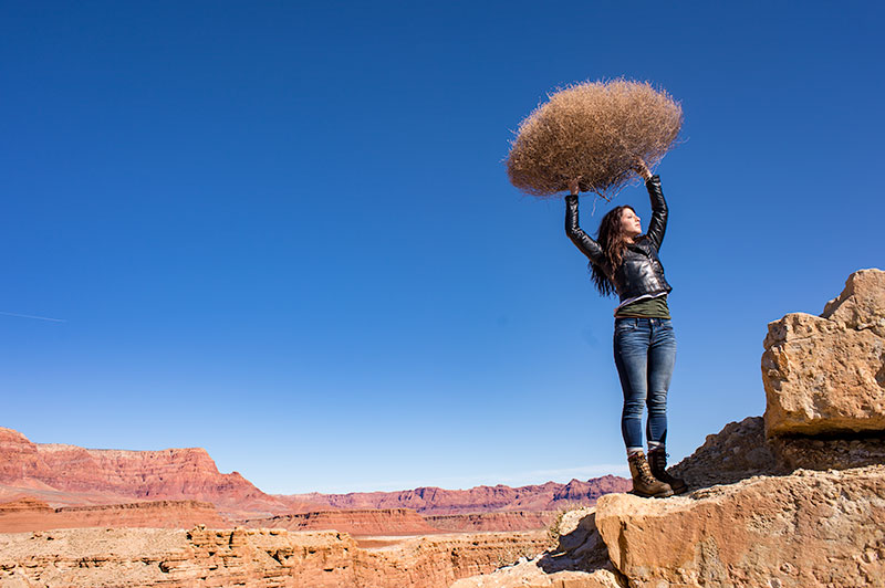
DAYLIGHT
Changing from As Shot to Daylight shows very little difference, although the daylight color balance makes it a bit more warm.
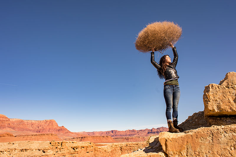
SHADE
Since the color of the light in the shade is a bit more blue, we add some warmth to the overall image to compensate for it. In this shot you can see the global warmth is not going to work because the image was not shot in the shade.
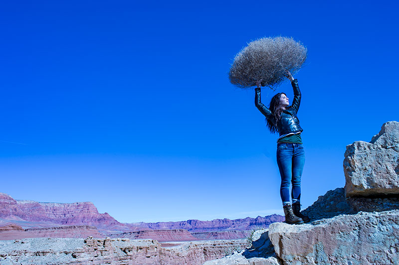
TUNGSTEN
Tungsten light is very orange, so when we apply a tungsten color balance to a shot that is not too orange, we get this very blue looking shot. This is a good reminder of just how ‘warm’ tungsten light is if it takes this much blue to make it correct.
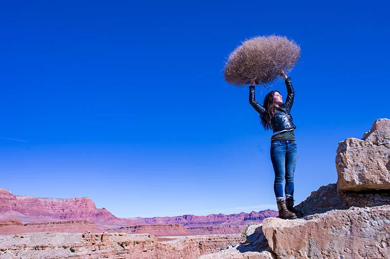
FLUORESCENT
Fluorescent light is blue/green so it makes it difficult to compensate for. In this application of the fluorescent color balance, we can see the sky going a deep blue, while the desert mountains behind become more magenta.
LOCAL LIGHT SOURCE MATCHED TO AMBIENT
Working with a secondary light source that may be a different color presents us with a challenge. We cannot change the image globally because adding a correction to the image to correct for the different light source will affect the entire image.
We must then change the different light source to the ambient (or overwhelming light) in order to ‘balance’ the subject in the ambient setting.
The ambient setting is the overwhelming light that we usually cannot change: the sun, a large warehouse, a home. Bringing in our own lights means we must know how to match what we bring to what is there.
ASSIGNMENTS FOR THIS CLASS:
- Using the color settings on your camera, take the same image with each of them. Shoot with Daylight, Shade, Tungsten, Flourescent at least and do this in places where those colors exist. In other words, shoot some images outside, inside with regular household lamps, and some place that has Flourescent. (NOTE: Many big box stores use a light source known as Mercury Vapor. Mercury Vapor is blue/green so it is very difficult to adequately address. We can add magenta to offset the green, but that turns the blue part of the light to purple. If we address the blue with something warm, we add that to the green part of the light.For Mercury Vapor correction, try “auto” on your camera setting. It is the best I have found for correcting most of that blue/green color shift.
- Using a strobe (speedlight), take a photograph of someone while the sun is going down behind them. Do not alter the strobe setting, just let it keep making the shot as the light turns warmer and warmer. You will then see how “blue” the light source seems coming from the flash.You may have to change the settings as the light gets dimmer, but I think you will see the changes pretty well.
We will be addressing color balance in all of the upcoming classes.
Portrait Class Members Discuss the Workshop
"Imitate. Assimilate. Innovate." - Clark Terry, Jazz trumpet genius. This portrait class (and the companion 102 class) have been huge successes. The students are fired up and some are saying they are making the best images of their lives. We look closely at the work...
24 Frames In May
Begins today. It's a non-contest, and just for fun. Not many rules, but a few guidelines: This is for film cameras only. Black and White or Color is fine, and there are no restrictions on the type of film you shoot. Polaroid is OK. 4×5 or sheet film cameras are OK....
New Photography Books
From Amazon. I love Photography Books, and have a wall of them waiting for me when I have some quiet time and simply want to stimulate my brain. From early works of Steichen and Cunningham to books by Demarchelier and Watson, the photography book is one of my great...
Light Conversation, Volume 2
A new bi-weekly, Lighting Essentials program. I call it "Light Conversation" and we discuss all things photography. Our next discussion will be Monday, May 11. Open to all LE readers. https://youtu.be/_O4uR0bU04Y Some links from this discussion: Canon white balance...
Two New Online Workshops
Project 52 Project: Incredible Egg (Shot to Layout)
The layout was furnished and the photographers had to shoot to a fixed set of parameters. Size and position of the type could not change. [gallery link="file"...
Nicole Fernley: Cookbook Project
Project 52 members sharing recent work. Nicole Fernley: "These four images come from a larger selection of images that I recently shot for The Cheese Lover’s Cookbook, so the common thread is, of course, cheese. The cookbook author made most of the food, and we worked...
David Price: Illustrated Proverbs
David Price: "This project grew out of some recent discussions about drawing inspiration from anyone, anything, and everything around you. I admit, I drew a lot of inspiration for this idea from Irene Liebler’s series she did across last year of Common and Idiomatic...
Learning from the work of Ritts, Lindbergh and Moon; Hiram Chee
Hiram Chee, one of the longest running members of Project 52, shares a post of portraits he did during the 8 Week Portrait Class. Learning from the work of Herb Ritts, Peter Lindbergh and Sarah Moon Check it out for some wonderful portrait work.
Anders Eriksson: “Cars and Drivers”
Anders Eriksson: Anders Eriksson
From the Early Days of Color Photography
The year was 1913. I absolutely love these images. From composition through framing and of course the patina, they are simply lovely. "Mervyn O'Gorman was 42 when he took these pictures of his daughter, Christina O'Gorman at Lulworth Cove, in the English county of...
Carol Rioux “Revealing a Portrait”
Carol Rioux: "I chose to make a series of portraits of a single person. I chose this project because I am very interested in everything that constitutes a person as it is important to me to capture who a person is not just a pretty picture. I photographed parts of...
Jay Chatzkel: “The Neighborhood”
Project 52 members share recent projects. Jay Chatzkel: A Day in the Life of the Neighborhood (PDF) Jay Chatzkel
Anna Gunn “Dreams in a Suitcase”
Project 52 Member shares recent work. Anna Gunn: "Concept: a girl who carries her dreams in a suitcase. These dreams aren’t plans, or in any way constructive – they are merely a distraction from the beautiful, fleeting moments that life places in front of her. Yet...
Read more“I have always been more interested in the power of what a good photograph or film can do – not who created it and what box that creator fits into. I’m interested in the story one has to tell. We are visual communicators and we are all unique but only if we listen to our own voice and create from that voice. Whenever I have trusted and listened to my internal voice and created from my own unique perspective and my life’s experiences, I have been “on purpose” and my work has resonated across genders, race and age. I suppose I could copy or mimic the “style du jour” whether it is HDR or photographing hipsters with tattoos and attempt to be someone I’m not. I don’t have the desire to do that because that is not why I became a photographer or filmmaker. That’s not to say that I don’t like and appreciate photographers who are following these styles but it’s not me and creativity doesn’t come from mimicking others. I’ve seen a lot of styles and techniques over the decades I’ve been in the photo business. They come and they go – just like the photographers who chase after the latest trend.”
“Labels, Finger Pointing, Fear, and the Real Value of Photography”
"I have always been more interested in the power of what a good photograph or film can do – not who created it and what box that creator fits into. I’m interested in the story one has to tell. We are visual communicators and we are all unique but only if we listen to...
Catherine Vibert: Environmental Portraits
Project 52 Members share some of their recent project work over the next five posts. Catherine Vibert: "Environmental Portraits & Personal Branding. Through the course of the year of the Project 52, I found that my favorite subject to shoot is people. I especially...
Portraits Inspired by Gregory Heisler
We spent a couple of weeks studying the work of Gregory Heisler. He is a remarkably talented photographer with a very disciplined approach to image making. The goal was to learn from his approach and find the inspiration to make images from what you garnered from the...
24 Frames In May (2015 Edition)
TWENTY FOUR FRAMES IN MAY Last year the Project 52 folks were invited to a special project: shoot 24 frames of film in the month of May. The idea was to treat a single frame of film with the same deliberate attention we would give it if it were a sheet of 8x10....
Portraits Inspired by David Bailey
Monday I shared the images from the 8 Week Workshop, and today I share some from the Portrait 102 Workshop. These photographers studied the work of David Bailey and were inspired to make some lovely portraits. [gallery columns="4" link="file"...
Ten Things About ‘Creativity’
Occasionally we find ourselves in an argument of whether or not 'creativity' can be taught, or does it have to be born within us? We read all about creativity and how important it is. We award little statuettes to really "creative" people. Creativity is blessed,...
Protected: “Light Conversation” Volume One
Password Protected
To view this protected post, enter the password below:
Portraits Inspired by Jeanloup Sieff
One of the photographers we are studying in the 8 Week Portrait class is Jeanloup Sieff. This master photographer created images in almost every genre from portraits and nudes to landscape and commercial. The idea is not to copy the work of each of the photographers...
These photos are sweeet!
The project 52 group looked at photographing sweets and chocolate this week. Some very tasty images were shot by the gang. I figured since it is Friday, I should let you in on some of them.
An Open Letter to People Who Write Open Letters
Last week an open letter dispute erupted on social media. That could be said of just about any week on social media, but this time it was about a photographer and a band who wanted to use a photograph. I found myself intrigued but after reading both letters I felt...