
LIGHTING PRINCIPLE THREE: THE COLOR OF LIGHT
We see light usually as a white source, or at least a neutral source.
It isn’t. neutral, it has a color to it and that color can influence all the parts of your image, from shadows to highlights. We don’t see the color of light because our brain changes it to a neutral “white” color as we see it.
Here is a wonderful article that explains the way that the color of light affects your image. Read it now.
When we look at the color of the scene in front of us we can change it globally by changing our color balance in the camera, or using a filter. What “globally’ means is that everything in the photo is changed to the same setting. All the colors are altered by this global change to the color of the light.
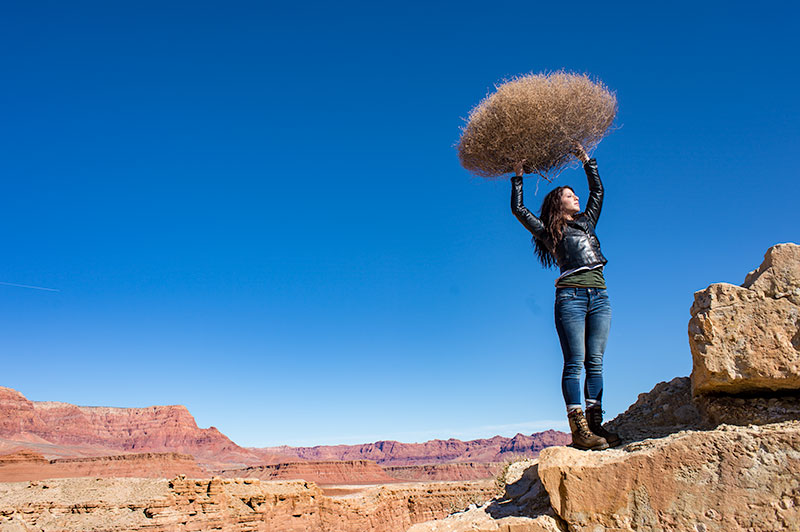
On the left is a photograph taken near Mable Canyon. The sun was quite bright, and there was a bit of warmth to the image because of all the warm browns and oranges of the topography all around us.
This image is as shot. I have applied global changes to the color of the light source so you can see what that does to the image.
Below from left to right:
Daylight / Shade / Tungsten / Flourescent
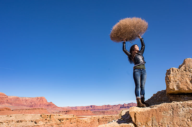
DAYLIGHT
Changing from As Shot to Daylight shows very little difference, although the daylight color balance makes it a bit more warm.
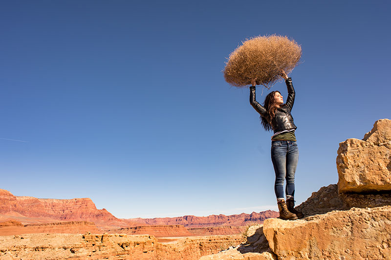
SHADE
Since the color of the light in the shade is a bit more blue, we add some warmth to the overall image to compensate for it. In this shot you can see the global warmth is not going to work because the image was not shot in the shade.
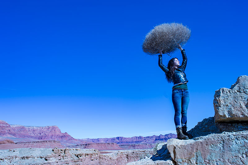
TUNGSTEN
Tungsten light is very orange, so when we apply a tungsten color balance to a shot that is not too orange, we get this very blue looking shot. This is a good reminder of just how ‘warm’ tungsten light is if it takes this much blue to make it correct.
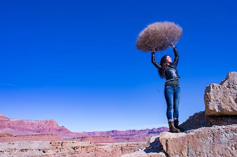
FLUORESCENT
Fluorescent light is blue/green so it makes it difficult to compensate for. In this application of the fluorescent color balance, we can see the sky going a deep blue, while the desert mountains behind become more magenta.
LOCAL LIGHT SOURCE MATCHED TO AMBIENT
Working with a secondary light source that may be a different color presents us with a challenge. We cannot change the image globally because adding a correction to the image to correct for the different light source will affect the entire image.
We must then change the different light source to the ambient (or overwhelming light) in order to ‘balance’ the subject in the ambient setting.
The ambient setting is the overwhelming light that we usually cannot change: the sun, a large warehouse, a home. Bringing in our own lights means we must know how to match what we bring to what is there.
ASSIGNMENTS FOR THIS CLASS:
- Using the color settings on your camera, take the same image with each of them. Shoot with Daylight, Shade, Tungsten, Flourescent at least and do this in places where those colors exist. In other words, shoot some images outside, inside with regular household lamps, and some place that has Flourescent. (NOTE: Many big box stores use a light source known as Mercury Vapor. Mercury Vapor is blue/green so it is very difficult to adequately address. We can add magenta to offset the green, but that turns the blue part of the light to purple. If we address the blue with something warm, we add that to the green part of the light.For Mercury Vapor correction, try “auto” on your camera setting. It is the best I have found for correcting most of that blue/green color shift.
- Using a strobe (speedlight), take a photograph of someone while the sun is going down behind them. Do not alter the strobe setting, just let it keep making the shot as the light turns warmer and warmer. You will then see how “blue” the light source seems coming from the flash.You may have to change the settings as the light gets dimmer, but I think you will see the changes pretty well.
We will be addressing color balance in all of the upcoming classes.
Time to Put the 8 Week Portrait Class Away for A While
Winding up one of the Portrait Classes: I have loved teaching these mini classes and studying some of the great modern portrait photographers. I believe much can be learned when one immerses themselves into the work and looks deeply into the work and styles of those...
More Portraits from the Portrait Class
(Image © Adi Talwar) Tuesday nights image review was a blast. So many good portraits that I have to share them with you all today. These portraits were influenced by the photographer Albert Watson who we studied for the week previous. [gallery link="file" columns="4"...
Moving From the Studio to The Great Outdoors: Meet Ken Howie
Ken Howie is a friend of mine and an excellent photographer. Ken used to have a studio in the same space as my old studio (and now, Dave and I are in his old studio). Ken was a consummate studio shooter. He was nearly 90%+ studio work - from product and still life to...
Portraits: June 2015
Student Work: A few of the amazing portraits students in the Portrait Workshops have turned in. There are dozens of truly great portraits. I am choosing only 16 for this post. [gallery columns="4" link="file"...
Perhaps It’s Time to Rethink “Photographer”
I got a beautiful pen as a gift from a client recently. Thanks for that, Randi, it is an absolutely gorgeous writing implement. And, I assure you, I will write with it. Because I am a writer as well as a photographer. Millions of pens are sold daily in the world. How...
It’s Father’s Day: Make a Photograph to Keep
The Best Photographs I Never Took It was Christmas a few years ago. My father in law came for the annual Christmas Dinner at the Giannatti’s. We host about 20 people here throughout the day, and Floyd always came over with his warm and infectious smile. The dude knew...
Sometimes the Nonsense We Tell Ourselves Can Make Us Crazy
Sometimes the Nonsense We Tell Ourselves Can Make Us Crazy. Today, I have a challenge for you all. Not one that I make lightly. And one that comes from a deep and abiding point of wanting you to be successful. Really successful. It has to do with barriers. Barriers to...
On Work Ethic – Nick Giron, Photographer
"Drive through your town and look at the businesses YOU DON'T go into and figure out why they work without you. Look at your business and ask why someone would want to come into yours. If you're the only one that knows the answer to that it could be part of the...
James Eisele, West Palm Beach FL Commercial Photographer
I met James Eisele down in West Palm Beach, FL when I did a workshop in that area. He showed a lot of talent and when I started the Project 52 course, he jumped in and became involved. I have watched his work improve at a very high rate, and his studio in West Palm is...
Tne New Sony Alpha a7RII Mirrorless Digital Camera
Is ready for purchase for those of you who may want a killer mirrorless camera.
Please Don’t Buy Stolen Gear
LensProToGo, a popular camera gear rental house and studio in Massachusetts was hit by the lowest of scum and had over a half million dollars of gear stolen. This gear will undoubtedly be offered for sale in shady cesspools of slime (their homes) and on line at...
Why I Have Decided to do Project 52 One More Time
https://vimeo.com/130593335 This will be year 5 of Project 52. It has matured and seen many alumni start businesses going from weekend warrior to full time shooter. P52 has helped many more photographers find their creative voice and look at the world in a different...
Off Topic Sunday: Gadgets, Gizmos, and Music
Every once in a while I get so many little things going on that I decide to share them with you all. I call them Off-Topic Sundays and they are always fun for me. So here we go: First... ever have your phone die on location? Not good, and since so many of us USE our...
Tucker Joenz, St, Augustine FL Commercial Photographer
Tucker Joenz was with Project 52 for a couple of years and in that time I watched him go from hobbyist to serious photographer. He works hard and creates wonderful pictures for his clients. Tucker also shoots self assigned personal projects that have garnered some...
Stephen Collins: Fredricksburg VA Commercial Photographer
I first met Steve when I did a workshop in Baltimore. It was a hot, muggy day but Steve never tired. He shot and asked questions and seemed to be very interested in getting better... which was a good thing. I kid Steve about how far he has come, but it is true. His...
Eric Muetterties: East Bay Commercial Photographer
Meet Eric Muetterties, a working photographer in the East Bay area of San Francisco. I met Eric 4 years ago at a workshop in North Carolina, and we shared a plane coming home. His attention to detail and love for the medium made me think he could actually do this...
Finding and Keeping Commercial Photography Clients: Part Four, Staying Connected
(NOTE) If you are just coming into this series, I highly suggest you start at Part One, and then do Part Two and Part Three before starting Part Four. Links for all of them are inside the protected area, and you can access them easily. A brilliant portfolio won't get...
Irene Liebler and Sandy Connolly: Starting the Journey
Irene Liebler was one of the Project 52 members from a few years ago. She did the course twice, I believe and rarely missed an assignment. She also rarely did an image that we were not blown away by. Irene is a consummate artist, and a painstaking perfectionist when...
Finding Commercial Photography Clients: Part Three; Getting Personal
(NOTE) If you are just coming into this series, I highly suggest you start at Part One, and then do Part Two before starting Part Three. Links for all of them are inside the protected area, and you can access them easily. So far we have been working on our portfolios,...
Finding Commercial Photography Clients: Part Two
"How do I find clients?" One of the most asked questions I get when chatting with photographers is where can they find clients. It is one of the questions I ask when reviewing a portfolio; "OK, these are nice shots. Who do you know who will pay you for this kind of...
Finding Commercial Photography Clients: Pt. One – Portfolio
https://www.youtube.com/watch?v=c7rj_D9t-kw Image Uses PDF Image Audit Tool PDF Ad Image Assessment PDF Finding and Keeping Clients Part One PDF Build a Solid Client List Finding and Keeping Commercial Photography Clients NOTE: This is a course for emerging...
Inspired by Skrebneski
The first set of images from the 8 Week Portrait Class came in last evening and they are really good. The class takes a close look at 8 major portrait photographers by analyzing what they do, how they accomplished their imagery and what the thought process was behind...
“Light Conversation” Volume Three
https://youtu.be/tv2EBtW5YLY Our next Light Conversations will be Monday, May 25. Join us.
“The Sprinklers” (A Mother’s Day Essay)
(My daughter, Alissa, wrote this Friday for one of her final assignments. It fits in nicely for mother's day.) Sprinklers My mom used to tell my sisters and me that if we ran through the sprinklers we would feel like different people. We could do anything, be...