This is a cover shot that we did for the fragrance company. We wanted a larger space and a more natural looking scene for the cover so we sought out a warm environment. Our AD found a beautiful home that fit the bill.
I knew the item that I would be shooting was small, and knowing that the idea was for a natural looking space, I didn’t need the big guns, I took a small, traveling kit we had at the studio and was off.
The space was a very pretty, large living room with 18′ of north light coming through floor to ceiling louvered windows. The room was simply awash in gorgeous, ambient light.
Before I get started, apologies for slow posting… I have been crazywickedbusy… and working on a book for final publication (although private) is taking every spare minute. I would like to thank SmugMug Professional for coming on as a sponsor. Every workshop attendee for the rest of the year will receive a free one year Pro Account at SmugMug. We also welcome Midwest Photo Exchange to the LE family. A big shout out to BorrowLenses.com and MightyImaging.com for their continued support.
Upcoming workshops are Atlanta and Mexico. I have openings for a few at both. The lineup for the summer is looking great. All attendees receive the workbook, a new DVD for the workshop attendees only, a copy of my book on PDF, the SmugMugPro account and more. We are currently doing weekly webcasts on New Media Marketing. As soon as we have the bugs worked out, that free weekly workshop will be available to all workshop attendees.
Well, let’s go on and take a look at how simple tools can be used to make a natural looking still life.
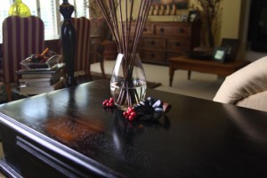
This is the room as we entered it: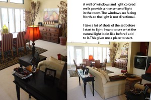
I will often pull the camera out and simply shoot in either Aperture Priority, or take a reading and shoot in manual to get a feeling of how the light is falling within the scene. This is very important when I want the ambient light to be included in the shot. Here you can see how it is falling across the background.
I made the choice to obviously keep the light at the same angle on the glassware. But as you can see in the shot above, there is no finesse to the light falling on the glass vase.
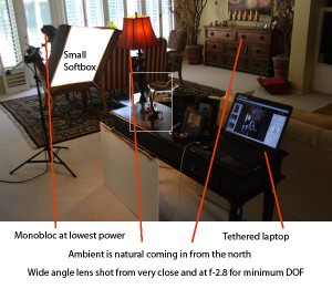
Bringing in a small softbox with a monolight at very little power added both, the rim light of the reeds and the large, white shape on the vase. I kept the light in as close as I could to give the larger shape. Knowing what the ambient was able to produce meant that I had to match it with the box.
We wanted very little depth of field, so I knew I would be shooting as wide open as possible. Using the 20-35mm 2.8 L Canon at 20mm gave me a very sharp foreground and some softened background textures. Getting in close to the subject fills the frame, and adds some more softness to the background.
Coni, the AD, wanted the light from the lamp to be included in the image, so that was a parameter that helped me define the shot as well. We had to move a lot of furniture around to get the shot we wanted. The background can be very distracting if there are gaping holes or something that stands out too much. The shot looks natural in the background because we set the background to the shot – moving things in at various angles till it looked good from camera. They may look askew in the real world… I only care about what they look like through the viewfinder.
Here are a few shots that we did as we were setting up the shot.
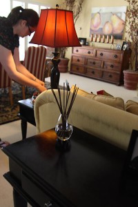
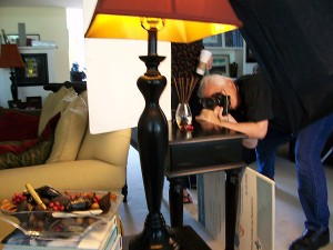
The glassware was looking better, and we had some nice color and light in the background. But the far side of the glassware – that side away from the light – was simply dying. I had Alisha, the client, holding a white card to the camera right side, and way back behind the glassware to add the little highlight you see on the right side of the vase. This adds a separation edge and also looks natural. The reason I had her hold it way back was to create a very small highlight, not a wide stripe that bringing it closer to camera would provide. Keeping the lamp in the shot also added a little warmth from the tungsten and the red lampshade.
We also decided that a little bit of flare from the side would create a more natural look. We shot it with both a little flare and with no flare. Blocking the lens from the light makes the shot very sharp, but the flare adds a little warmth to it.
You can see the setup in this shoot shot that Coni did. Here we are checking the light and the highlight placement to get the look to the glassware we want.
Here is the setup shot. You can see the small softbox, boomed in from the left, and the tethered computer showing what we are doing instantly and keeping the client and AD informed of what we are doing. These shots require placement of typography, and sometimes other considerations. The Art Director knew exactly where she wanted her negative space for adding the copy and headlines for the cover. The tethered shooting gave her a lot of confidence that we were shooting the shot she needed.
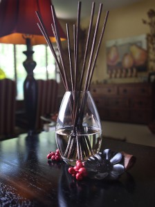
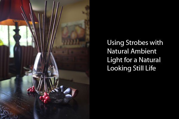
The final shot, sans headline and type.
Thanks for coming by. I will be making more updates in the following weeks – I promise.



I was searching through Google doing research for a blog article, when I found this blog, and while not what I was exactly looking for I found it very informative and interesting. Thanks Sophie xx