 FRAGRANCES: IT’S ALL ABOUT THE PACKAGING
How do you show a fragrance? How do you tell your customers what something smells like? How do you describe the fragrance of a great perfume to someone who may want to buy it?
We cannot put it on the page (well, those scratch and sniff ads from the 80s were cool but so costly). We can use overused words like “fresh” and “lilac-infused-summer-rain-on-a-beach-in-Tahiti-while-partaking-of-a-mimosa”… but that doesn’t really help the consumer when confronted with the point of purchase.
But we can design the bottle and packaging to be unique enough to tie the name to and help the recall of the consumer.
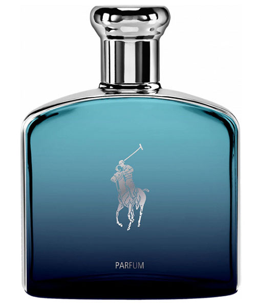
Ralph Lauren is known for classic styling, the elegance of sparseness, and of course the omnipresent Polo player. How they blend that aesthetic into all they do at Polo lets them create a bottle that is exactly on brand. You know the brand and trust the label.
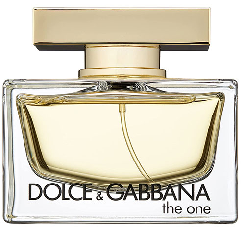
The women’s fragrance by Dolce Gabbana uses a very curved and stylish bottle with a strong, brutalist cap. The brand is about strong, unique women, and the power that the bottle displays is at once enchanting, and strong.
 The unique shape of the bottle, along with the block nature of the cap helps DG establish a brand look that reminds the viewer each time they see it. The bottle has a bold shape, and that is what the photographer must keep in mind.
In some brands, the bottle is more costly than the 2 or 3 ounces of fluid inside.
The designer wants his/her bottle to be seen and shown in a way that reveals the design, the uniqueness of the container, and the nuance that they put into the design.
The brand wants the images to be one that lets the consumer know what to expect when they take off the wrapping and pull out that delicately shaped glass container.
Fragrance companies have to sell you the bottle first, the brand second, and the fragrance comes last – when you open it up and dab it on.
STYLE AND TASTE REFLECTED IN THE BRAND
When working with brands, you must have a deep understanding of what they want to say, who they want to say it to, and how they believe they can get that message out.
Brands mean constraints. What, who, when, and where are all considerations of the brand when they are figuring out a direction for the visual parts of their campaigns. It is not our job to argue their point, but to provide the imagery they need in the way they need it while also letting our own visual style be seen.
It can be a delicate balancing act, but in the end, the client IS the final voice in this chorus of creativity.
Just think of how some of the brands you know position their products in a visual sense. Harley Davidson is not “dress up, tea in the Hampton’s”. Tesla is.
Guess Jeans are youngish and provide a whimsical look at the sensibilities of people who live a lifestyle of beach and parties.
Wrangler Jeans, on the other hand, have a more “workman” look in the ads. The women are not sexualized, and there is a distinct visual direction of working people, especially in the American West. A far more casual approach to the wearing of jeans than the ads above.
Learning to see the different ways that the visuals are shown helps you to understand “brand” and helps you make decisions in what you do with the product you are about to shoot.
EXERCISE:
Look up three different brands of fragrances on Google. Study them as a whole – what is the overall approach that is taken by the brand to make the images more cohesive, and help to preserve the brand of fragrance in the minds (and smellers) of their customers?
Take a few single images and take a deep dive into how they were shot.
Where is the light coming from?
If the bottle is translucent, can you see the background through the liquid?
Does the label contain any metallics (gold and silver are the most common)?
Are the metallics being lit well?
Does the label look sharp?
What is the overall ‘viewpoint’ of the photograph?
Can you make a photograph that would fit into their already formed style?
LIGHTING A CURVED BOTTLE.
LIGHTING A FACETED BOTTLE
OPAQUE BOTTLES
ASSIGNMENT:
One or several fragrance bottles showing us the shape, color, dimension, and texture of the bottle(s). This is a still-life product shot.
PROPS: Be very careful with props. Use what you want, but remember that they must support the ‘brand’ – real or fictitious – of the fragrance. The condition of the props is also important. If there are scratches and such, take them out in Photoshop.
POST PRODUCTION: All images are to be in color. No black and white or monochrome images. Post production style should be whatever you like, but remember that garish colors – if used – must be brand specific. Clean up all flaws, and make sure your highlights are not broken or tattered.
ONE IMAGE AND ONE BEHIND THE SCENES SHOT.

