8-WEEK PRODUCT WORKSHOP 2025
ASSIGNMENT FIVE
PACKAGING
ASSIGNMENT UPLOAD
1. Must not be larger than 1200 pixels on the longest side.
2. Must be .jpg format
3. Include BTS shots (at least one per set)
|
Upload files
|
|
|
|
|
|
|


|
|

ASSIGNMENT FIVE:
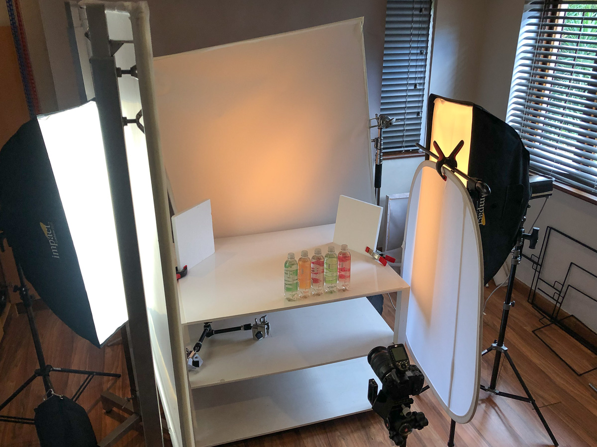
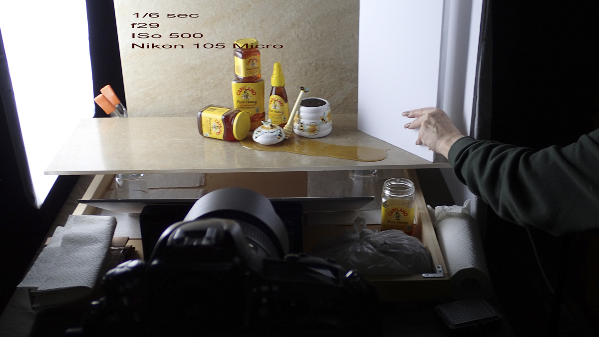
Shoot packaging or product that IS its own packaging. Remember the behind the scenes shot.
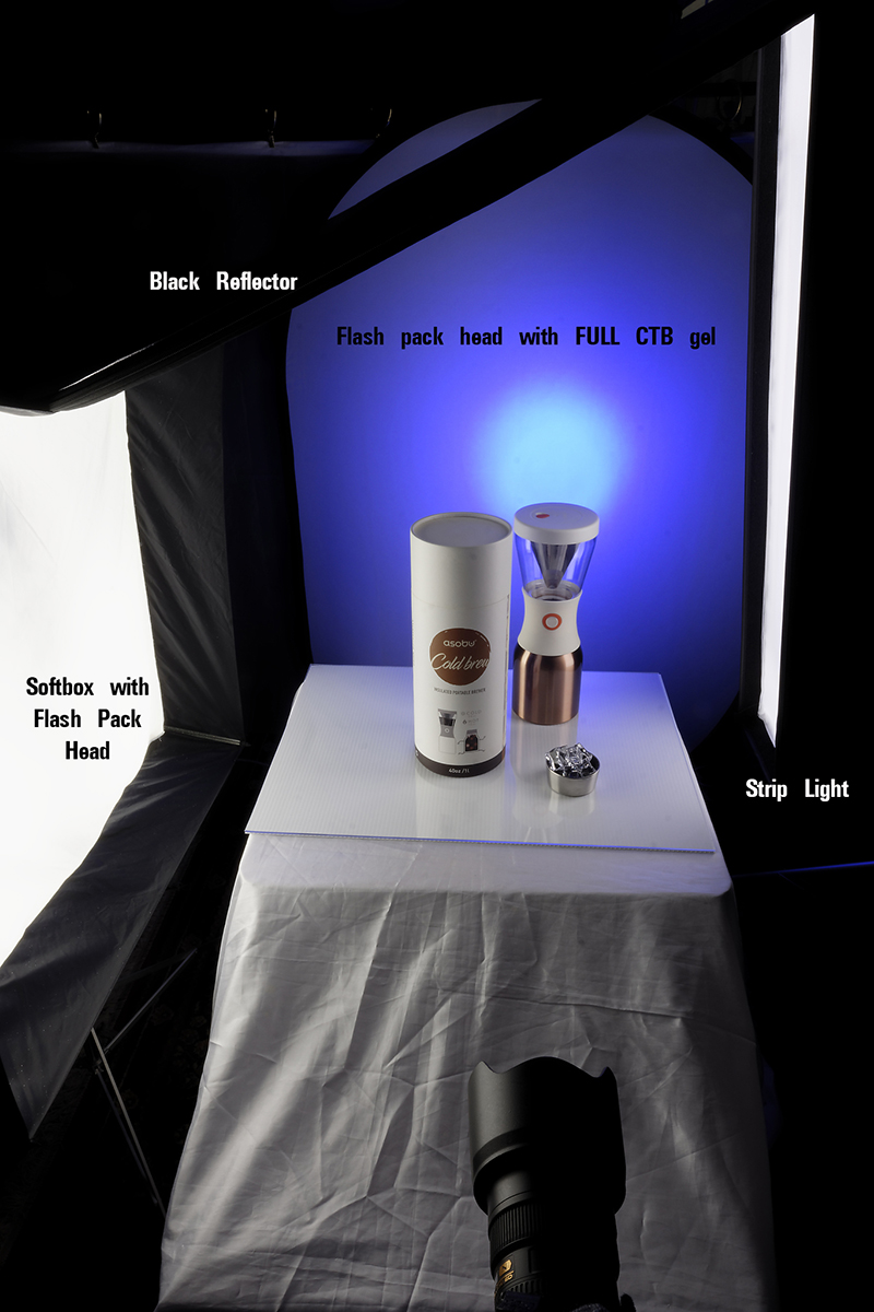
The Challenge of Photographing Packaging
Shooting packaged goods is one of those jobs that sounds easy—until you try it. Every packaging photographer knows that sleek, professional images don’t just happen by accident. You’ve gotta overcome several pesky challenges to make packaging look flawless.
Here are some of the main hurdles you’ll face, along with how you can tackle them:
1. Keeping Edges Clean, Closed, and Crisp
- Challenge: Packaging edges, flaps, and corners often don’t sit flat or neatly closed, creating uneven seams and distracting shadows.
- Solution:
- Use small pieces of double-sided tape, glue dots, or transparent glue strips to hold edges securely in place.
- For paper boxes or cartons, use invisible thread or fishing line strategically hidden behind the package.
- Shooting tethered helps catch imperfections early, letting you adjust quickly.
2. Metallic Logos and Reflective Surfaces
- Challenge: Metallic foils, reflective lettering, or glossy finishes tend to produce unwanted reflections, hot spots, or uneven brightness.
- Solution:
- Diffusion panels, softboxes, or scrims can help manage reflections and evenly disperse the light.
- Flags, black cards, or carefully placed white reflectors shape reflections, allowing highlights to accentuate logos or metallic text without overwhelming the image.
3. Color Consistency
- Challenge: Printed packaging colors need accurate reproduction for brand integrity, especially across a product line.
- Solution:
- Use a color calibration chart (like X-Rite ColorChecker) to set a baseline for color accuracy.
- Maintain consistency with lighting setup and camera settings throughout the shoot to streamline post-production color correction.
4. Texture and Surface Detail
- Challenge: Matte textures, embossed lettering, or subtle patterns can disappear without proper lighting.
- Solution:
- Side or raking light helps accentuate surface textures and embossing.
- Adjusting the angle of incidence and camera positioning highlights subtle details without losing overall lighting balance.
5. Managing Transparent or Translucent Packaging
- Challenge: Transparent plastics, glass, or translucent materials often produce internal reflections, refractions, or visibility issues.
- Solution:
- Light the product from behind or below to enhance transparency and prevent dark interiors.
- Avoid strong direct lights; soft, diffused backlighting usually works best for transparent packaging.
6. Dust and Fingerprints
- Challenge: Every tiny speck of dust, fingerprint, or smudge becomes a glaring issue under studio lights.
- Solution:
- Wear gloves when handling products.
- Keep compressed air cans and lint-free cleaning cloths handy.
- Consistently inspect packaging at high magnification during shooting (zooming in on tethered images).
7. Distortion and Perspective
- Challenge: Boxes and rectangular packaging are sensitive to lens distortion and perspective issues, creating skewed lines or awkward proportions.
- Solution:
- Opt for longer focal lengths (85mm or longer) to minimize distortion.
- Precisely align the camera parallel to the product to maintain correct proportions and straight lines.
8. Packaging Integrity and Imperfections
- Challenge: Minor dents, scratches, misprints, or manufacturing inconsistencies show up easily.
- Solution:
- Request multiple packages from the client to select the best possible versions.
- Always inspect products closely ahead of shooting, and be prepared to swap items mid-shoot.
- Keep some items unopened and pristine as backup.
Showing both the product and the packaging, the photographer also shows a typical ‘use’ of the product with the introduction of the business card. Soft light and a bit of soft DoF add to the aesthetic of this all natural, renewable material packaging.


A far more dramatic presentation of a selection of jewelry boxes. In order to drive home the fact that they are jewelry boxes, some jewelry is added for color and texture. Note how the lighting brings out the shape of the boxes and highlights the bevel aspects. I am not crazy about the lighting on the jewelry as it seems garish and amateur, but the boxes do look good. Perhaps a spray behind them would give them a bit more interest?
A far more dramatic presentation of a selection of jewelry boxes. In order to drive home the fact that they are jewelry boxes, some jewelry is added for color and texture. Note how the lighting brings out the shape of the boxes and highlights the bevel aspects. I am not crazy about the lighting on the jewelry as it seems garish and amateur, but the boxes do look good. Perhaps a spray behind them would give them a bit more interest?


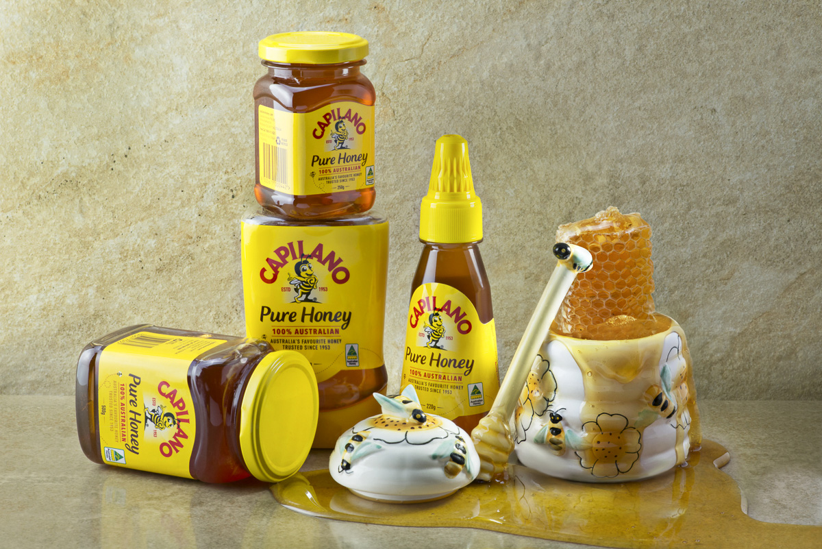
Using a medium gray background to allow these warm colors to pop, the photographer also took extra care to make sure the gold leaf logo really stood out. Good styling and very clean lighting guarantee the image will print or be seen easily, and the label is easily read. Opening the box is necessary to show the details of the bee illustration on the inside.
🙂
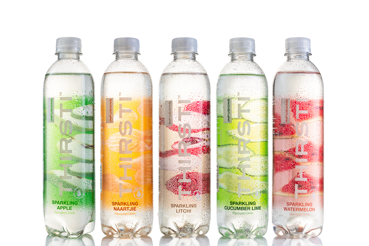
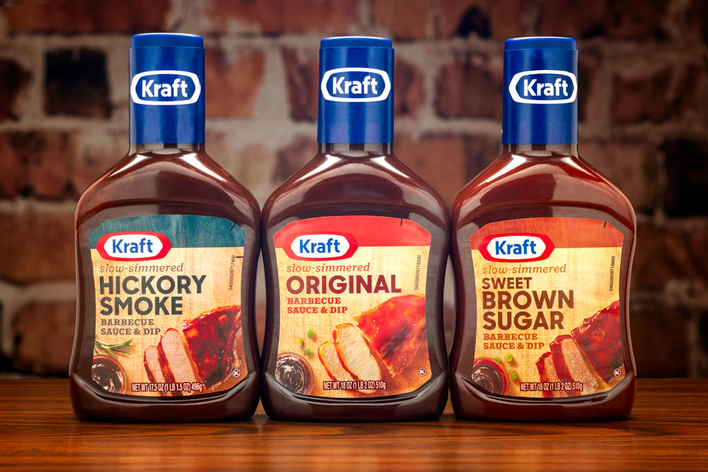
Fantastic detail on these packages gives the photographer a lot to think about. Textures of the label, the bottle, the string and the hang tag are all shown with precision and attention to detail.The side lighting does the desired effect on all of parts of the bottles, but a close examination of the front bottle shows a white reflection running straight up the label in order to make it seem more metallic and to offer a gradient. This fill is slightly seen on the outside bottles as well.
Attention to detail. The product shooters mantra.