
LIGHTING PRINCIPLE THREE: THE COLOR OF LIGHT
We see light usually as a white source, or at least a neutral source.
It isn’t. neutral, it has a color to it and that color can influence all the parts of your image, from shadows to highlights. We don’t see the color of light because our brain changes it to a neutral “white” color as we see it.
Here is a wonderful article that explains the way that the color of light affects your image. Read it now.
When we look at the color of the scene in front of us we can change it globally by changing our color balance in the camera, or using a filter. What “globally’ means is that everything in the photo is changed to the same setting. All the colors are altered by this global change to the color of the light.
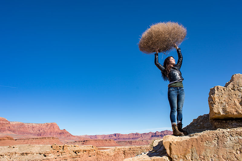
On the left is a photograph taken near Mable Canyon. The sun was quite bright, and there was a bit of warmth to the image because of all the warm browns and oranges of the topography all around us.
This image is as shot. I have applied global changes to the color of the light source so you can see what that does to the image.
Below from left to right:
Daylight / Shade / Tungsten / Flourescent
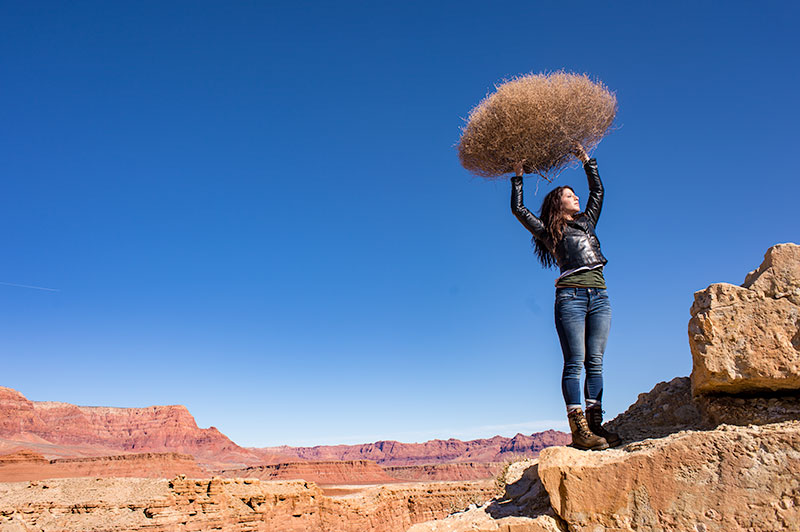
DAYLIGHT
Changing from As Shot to Daylight shows very little difference, although the daylight color balance makes it a bit more warm.
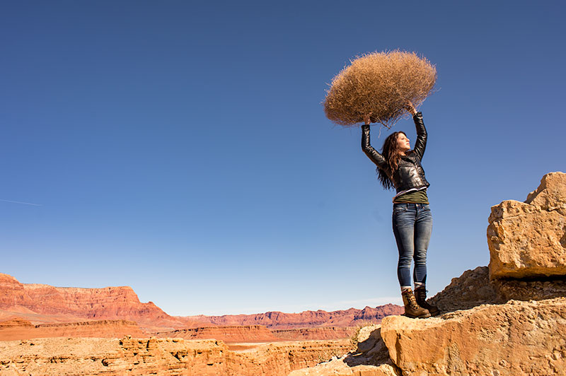
SHADE
Since the color of the light in the shade is a bit more blue, we add some warmth to the overall image to compensate for it. In this shot you can see the global warmth is not going to work because the image was not shot in the shade.
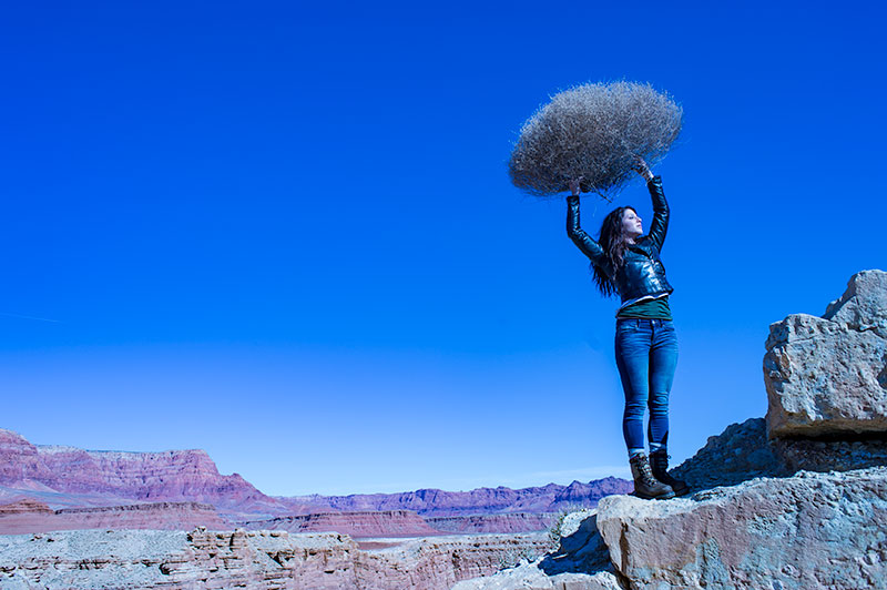
TUNGSTEN
Tungsten light is very orange, so when we apply a tungsten color balance to a shot that is not too orange, we get this very blue looking shot. This is a good reminder of just how ‘warm’ tungsten light is if it takes this much blue to make it correct.
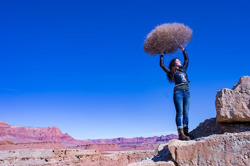
FLUORESCENT
Fluorescent light is blue/green so it makes it difficult to compensate for. In this application of the fluorescent color balance, we can see the sky going a deep blue, while the desert mountains behind become more magenta.
LOCAL LIGHT SOURCE MATCHED TO AMBIENT
Working with a secondary light source that may be a different color presents us with a challenge. We cannot change the image globally because adding a correction to the image to correct for the different light source will affect the entire image.
We must then change the different light source to the ambient (or overwhelming light) in order to ‘balance’ the subject in the ambient setting.
The ambient setting is the overwhelming light that we usually cannot change: the sun, a large warehouse, a home. Bringing in our own lights means we must know how to match what we bring to what is there.
ASSIGNMENTS FOR THIS CLASS:
- Using the color settings on your camera, take the same image with each of them. Shoot with Daylight, Shade, Tungsten, Flourescent at least and do this in places where those colors exist. In other words, shoot some images outside, inside with regular household lamps, and some place that has Flourescent. (NOTE: Many big box stores use a light source known as Mercury Vapor. Mercury Vapor is blue/green so it is very difficult to adequately address. We can add magenta to offset the green, but that turns the blue part of the light to purple. If we address the blue with something warm, we add that to the green part of the light.For Mercury Vapor correction, try “auto” on your camera setting. It is the best I have found for correcting most of that blue/green color shift.
- Using a strobe (speedlight), take a photograph of someone while the sun is going down behind them. Do not alter the strobe setting, just let it keep making the shot as the light turns warmer and warmer. You will then see how “blue” the light source seems coming from the flash.You may have to change the settings as the light gets dimmer, but I think you will see the changes pretty well.
We will be addressing color balance in all of the upcoming classes.
Peter Lindbergh: Images of Women II
PETER LINDBERGH: IMAGES OF WOMEN II Lindbergh is one of the most popular photographers we study in the 8 Week Portrait Class. His work is simply brilliant and so many of the students have an immediate affinity to his authentic, intimate way of shooting. His new book,...
In Commercial Photography Some Things Change and Some Things Don’t
Some Things Change, and Some Things Stay the Same The constant, and rapidly changing landscape of photography continues unabated. Some may think of this as a very scary time to be in this business. They may be right… for them. For me it is nearly a miraculous time to...
Shooting Ice Cream with Photographer Rick Gayle
PHOTO BY RICK GAYLE, PHOENIX I will simply link to Rick's article here. Rick is a Phoenix photographer specializing in still life and food. This is a nicely done article documenting a shoot for Coldstone Creamery. BTS shots as well as some finished examples. You can...
Read more“I think that its a society that has totally lost its bearings on the terms of what its values are, and so its put all its value into celebrity. There is such a lack of spiritual self confidence perhaps that the achievers seem to have to be the kind of holy cows that people worship.”
— Editor, Vanity Fair, ca 1993
Annie Leibovitz Documentary
"I think that its a society that has totally lost its bearings on the terms of what its values are, and so its put all its value into celebrity. There is such a lack of spiritual self confidence perhaps that the achievers seem to have to be the kind of holy cows that...
Read more“The great thing about the job was that in the evenings when we weren’t doing these ads, we photographed Anjelica Huston and Julie Driscoll. Polly Mellon, the fashion editor was there – it must have been for Vogue. Julie Driscoll was a pop singer with Brian Auger and Trinity. Musically they were a very hot band at the time. At the end of the shoot, Dick (Avedon) gave her a kiss and she, being very, very English, said in her slightly Cockney accent, “Oh, I bet they’ll be awful,” which is a totally English way to say “Thank you.” He just froze. He sort of straightened, and said, “When I take pictures, they’re good.””
— Neil Selkirk on Richard Avedon
Neil Selkirk with Elizabeth Avedon
"The great thing about the job was that in the evenings when we weren’t doing these ads, we photographed Anjelica Huston and Julie Driscoll. Polly Mellon, the fashion editor was there - it must have been for Vogue. Julie Driscoll was a pop singer with Brian Auger and...
Two Articles on Printing at Nearly the Same Time
Awesome coincidence? Or a convergence of some unknown force? I do not know, but it is interesting nonetheless. Last week Petapixel ran an article I had written titled "Prints. Remember Prints?" (Article Here) Almost immediately afterwards they ran Lynne Cartia's...
Moodboard: Edgy Portraits
Here are a few portraits that caught my eye last week. I hope you enjoy the picks. Ryan McGehee delivered this exceptional portrait. Brave crop, lighting that engages and mystifies and an absolutely charming face. Kine Meijer showed this unique portrait and knocked me...
Marilyn Monroe by Nahum Baron
I just love this image. I don't really know why. Photograph by Ted (Nahum) Baron. --- My friend and mentor, Selina Maitreya is sharing a lot of great stuff on video. There is an upcoming course, but you can grab a lot of great info from these videos. Check them out...
Join Selina Maitreya in a Free Video Course to Help Move You Forward.
I have known Selina for many years. I have all of her books, and have trained with her. I consider her a mentor, coach and friend. Selina has joined us here on Lighting Essentials many times, and each time is a delightful experience for me. Selina was perhaps the...
Read more“Be daring, be different, be impractical, be anything that will assert integrity of purpose and imaginative vision against the play-it-safers, the creatures of the commonplace, the slaves of the ordinary.”
–Peter Lindbergh
Never play it safe
"Be daring, be different, be impractical, be anything that will assert integrity of purpose and imaginative vision against the play-it-safers, the creatures of the commonplace, the slaves of the ordinary." --Peter Lindbergh
The Proof Is In The Pudding… Make Sure You Have a Killer Recipe
“The proof is in the pudding.” Always wondered about that term, so I looked it up. According to the Urban Dictionary; “The original phrase is "The proof of the pudding is in the eating!" Which means you have to eat the pudding to know what's inside of it. The modern...
Ten Beliefs That Suck the Life out of Photographers
What if I told you it was not the industry, the bad economy, where you live, what camera you shoot with, how many lights you have or how small your Facebook following is that is holding you back. None of those are truly capable of stopping you, they are only...
How Can A Single Photograph Tell a Story?
Recently Stefan Sagmeister posted a video in which he excoriates designers for using the word “story” in their descriptions of what they do. Whether you agree or disagree, it is a compelling video. Personally, I am not 100% on board with his statements. There are some...
P52 Member Alicia Bonterre wins Two ADDY’s… WOW
CONGRATULATIONS, ALICA!!! Alicia Bonterre started with P52 about two years ago. She wanted to up her game, create images outside of her comfort zone, and become better at commercial photography. She just won two ADDY's - A GOLD and a SILVER ... so, we can safely agree...
From the Portrait Workshop: Inspired by Dan Winters
Imitate. Assimilate. Innovate. -- Clark Terry, jazz trumpet legend. It is still the best way to learn art. And it drives the style of teaching I do. I don't want anyone to copy anyone else, but rather to be inspired by the work of others. In the portrait class, we...
8 Week Workshop: Portraits Inspired by Herb Ritts.
The goal is not to copy, but be inspired by... Learning about a photographer like the remarkable Herb Ritts helps us to evaluate our own work, see it with new eyes and blend what we learn into our own mix. The photographers who study the past forge new paths into the...
A Few Words on that “Unphotoshopped Cindy Crawford Photo” Crap
A few days ago, this was making big news online... wow. Imagine Cindy Crawford having the guts to go public in a photograph that was un-retouched in Photoshop. Yeah... wow. Big F'n Deal. Of course she did that for two decades and more. You know that, right? Of this I...
New Camera Announcements from Canon
Some amazing new cameras from Canon. I don't get involved in new gear releases, but this stuff is starting to get exciting now. Canon D5 PRODUCT HIGHLIGHTS 50.6MP Full-Frame CMOS Sensor Dual DIGIC 6 Image Processors 3.2" 1,040K-Dot ClearView II LCD Monitor Full HD...
Going North – Taking a Photo Trek
Every year I host a meet-up of Project 52 members. Part workshop, part social, full on fun. There is no fee for this, we share all expenses, so it is a very comfortable and relaxing time with the tribe. This year we will also be doing a road trip to the north country....
A Simple Photo of a Red Balloon
The recent assignment in Project 52 was to shoot a single red balloon and make it the focal point. The students made some amazing images. And shooting a red balloon is not the easiest thing to do. Give it a try - all you need is a camera and a red balloon. Here...
Portraits Inspired by Peter Lindbergh
This week we looked at the work of Peter Lindbergh. These are the images that the students in the 8 Week Portrait Class did after studying Lindbergh. The workshop is designed for inspiration, not copying. "Imitate. Assimilate. Innovate." - Clark Terry, jazz trumpet...
New Photography Books
New Photography books on Amazon.
“What Do You Charge For? EBook
Last summer I wrote four articles based on the five scariest words a beginning photographer can hear... "What do you charge for..." It ended up being nearly 20 pages, and it can definitely help you work through some of the myriad questions that haunt us when we don't...
Peta Pixel Article on “Professional Photography”
PetaPixel printed my article on changing the brand for photographers. I titled it "What If Clients Don't Need Professional Photography" as a way of saying that the picture centric medium has changed to brand centric. Photographers must engage with the clients at a...