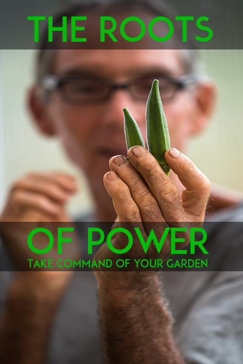
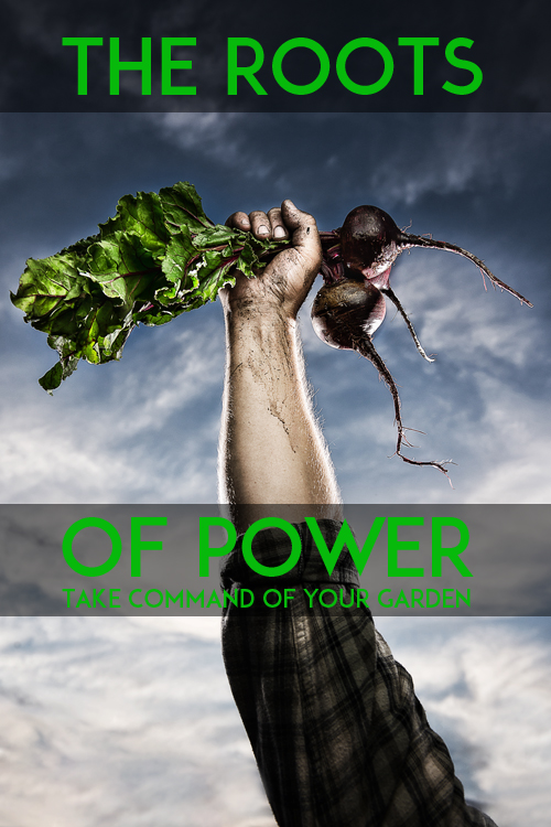
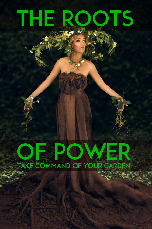
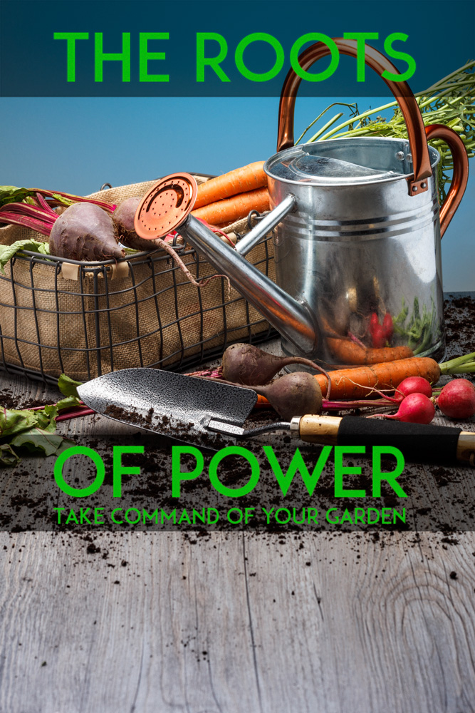
One of the most difficult parts of commercial photography is shooting to layout. A designer or art director has an approved layout, and your shot must work within the elements on the page. We see it a lot in catalog, advertising, collateral, and web oriented assignments.
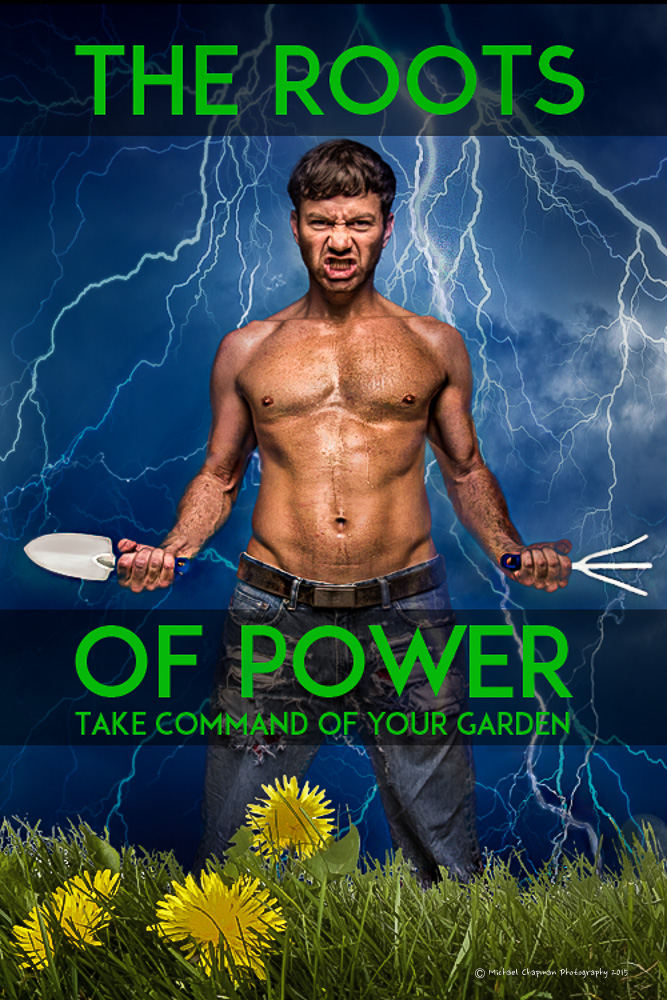
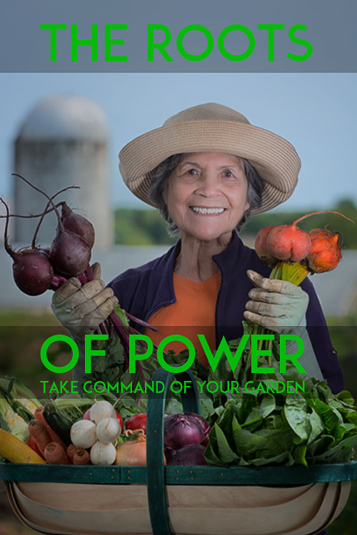
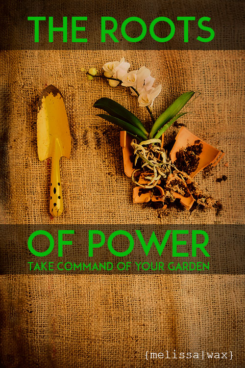
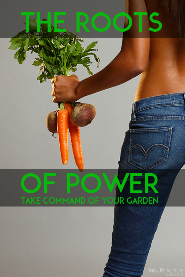
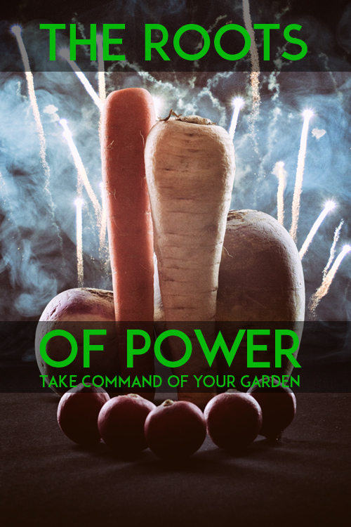
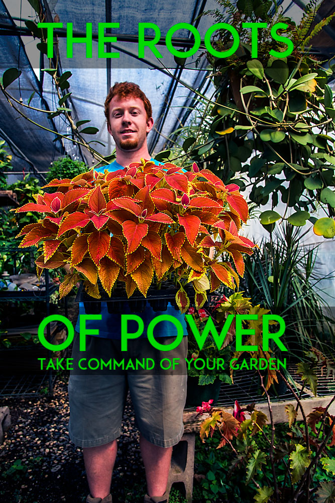
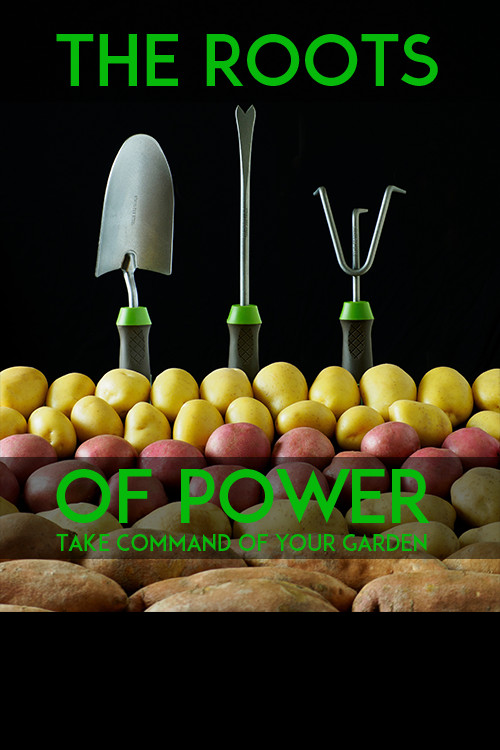
For this particular assignment, the image had to be crafted to fit in the pre-approved design of the point of purchase (POP) display. Designed to go in hundreds of mom ‘n pop hardware stores and nurseries the goal of the shot is grab some attention and get the viewer to take a brochure. There would be three brochure racks hanging below the lower band and hide most of the image.
The photographers most important consideration is that the focus of the image must fall in between the two banded areas with type already there. The idea is a play on words meant to bring a touch of whimsy to the mundane world of seeds and gardening tools.
The students were furnished with a PSD file in layers, as well as a transparent PNG for Lightroom which allowed shooting tethered right into the layout.
The students did an amazing job… here are 12 of the shots. You can see the whole class take on the Project 52 Class site.