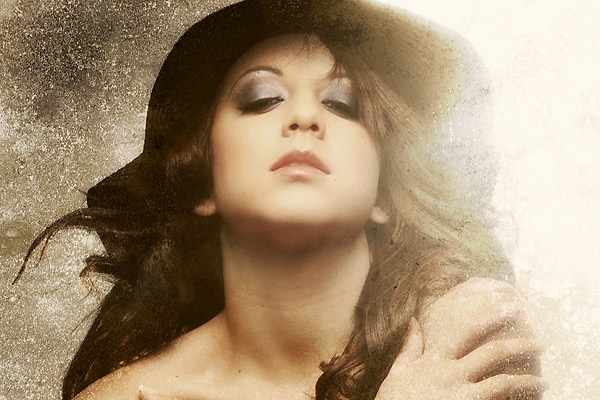
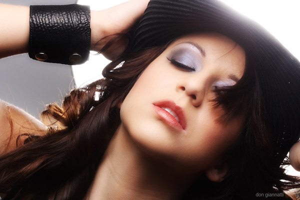
Our last shot in the hat series. This was a shot that used one light for a background and the other for a dramatic front light. The two lights we used in this set are a Norman Beauty Dish and a silver/white Zebra umbrella.
The beauty dish was used as a background. I wanted a big flare thing going… it was what I was seeing in my head and I thought that the big black hat could really be cool for that.
I always see an image before I start to light it. When Briana and I were trying to figure out what we were going to do with the black hat I saw the light come through her hair. That triggered an idea for having a lot of light ‘flaring’ around her. I knew the umbrella wouldn’t work, but the beauty dish may.
We placed the beauty dish off to one side a bit to get the flare on only that side. Both lights have the same power and the beauty dish was aimed right at the camera. Flare? Oh, yeah… we got some flare going then. Here is another shot from the series:
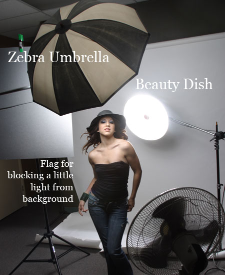
Here is a setup shot showing the placement of the umbrella and the beauty dish:
|
Information for today’s photographer. From novice to pro, LE Magazine has it all. |
 |
 |
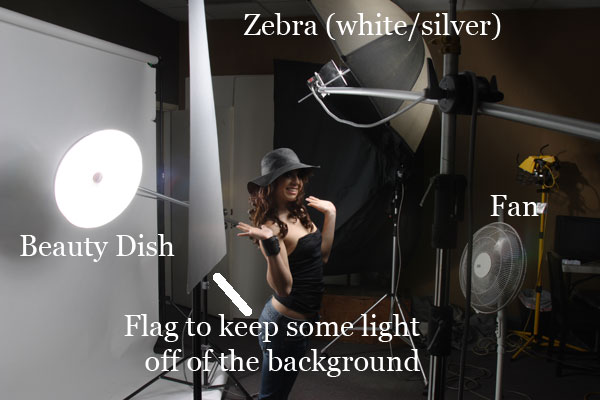
This side shot shows the distances of the lights. Keep in mind that it is shot with a wide angle lens so the items seem a little more distant than they actually were. When the beauty dish popped, Briana could feel the heat on her back… it is pretty close.
I shot with both my 100MM 2.8 and the 80-200mm 2.8L zoom. Interestingly I got a lot less flare from the beauty dish on the 100MM than on the 80-200. It may be due to age, the zoom is an older model, but it was definitely very noticeable on the screen.
You can see the ‘flag’ to keep a little bit of light off the background. It was getting so much spill light that it was going to bright. I wanted it just a little toward the light gray. Placing that large card did give me enough to make that side of the image a little gray, allowing the bright side to seem so much brighter.
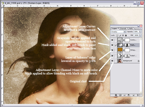
Here is a snapshot of the Photoshop technique I used for the main shot. I will be doing some more Photoshop tutorials, with movies and work files. Watch this site and the magazine site for more information.