… or something like that.
I don’t remember the particulars on the slant of the article.
Late on a Monday, the art director called in a panic with a rush job. Could I do an illustration for a publication that was going to press on Wednesday. We had to shoot it, approve it, scan it, get it separated and into the layout in a day.
Sure, we can do that. She faxed over the page layout and the ideas for the shot and we went out to get the props instead of heading to a planned dinner. (You gotta have a very understanding spouse in this business.)
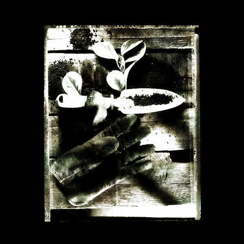
I started out at the local hardware store and they had the scoop thing, as well as some very course fertilizer. They also had some very nice work gloves that I bought. I had an idea, but I know I needed gloves anyway, so I got them and we headed back to the studio.
On the way, I dropped in on a local nursery down on Baseline and about 32nd St and made one of the guys an offer. Trade the brand new gloves for his pair of ratty old gloves. Well, it was a deal he couldn’t turn down.
So back to the studio and it was now going on 6. The AD was waiting and we got going on the shot.
She wanted:
Black and white.
“Gritty and Earthy”
Vertical
It will be framed by copy.
Small area bottom right to be used for copy (call out).
More After Jump.
I suggested we use black and white Polaroid Type 55PN and keep the edges of the negative rough and ‘earthy’ to help with the overall look she wanted. It would also allow her to leave the studio with finished art to drop by the printer for scanning and separating.
The small piece of plant was provided by the long suffering plants in the lobby area of the studio. and the old wood was from our prop area. An old beat up pallet for shipping was used. (It had set outside for a couple of years so it was a wreck. Woo Hoo.)
We set up the still life on a short table (2 ft) and brought over the camera, a Toyo 4×5 Monorail with a 210MM Schnieder F5.6 lens.
Neither of us were happy with the softlight shot we started with… it looked way too ‘straight’ and commercial. We needed something a little more gritty for the lighting… where the lighting becomes part of the image.

Editorial Shot for a Magazine taken on Polaroid and split toned.
I took two Norman heads and grid-spotted the 12inch reflectors. Bringing them to the same height of the set allowed me to ‘rake’ the light from bottom right and top left. That proved to be a little too contrasty for me. so I inserted a spun glass diffuser in the grid-spot. That worked.
Now I was able to light the glove from both sides… not a main/fill look, but something very much more interesting. The tool was then becoming a problem… it looked too ‘generic’ and boring. A silver spade and light wood handle didn’t say anything about anything.
I suggested we do something with the spade to make it look more like the hero. It is the spade that was able to deliver the fertilizer/pesticide or whatever it was we were trying to illustrate, so we needed it to be ‘heroic’.
I painted it white with quick drying spray paint. I always kept a few cans of white, black, silver, gold, gray and red. (I was quite the ‘tagger’ you know… 😉
The light simply lit that spade up like crazy and we loved the look. We added a tall piece of wood taped to a background stand to the front of the light camera bottom, right and that shadow added a bit more mystery to the light.
We settled on the image after working with the props, and in total I think I shot about 12 or so images. Processing them and clearing/fixing them right there on set.
As she was pulling together some notes and helping my assistant clean up the shoot set, I went to the darkroom and made a few contact prints of this negative.
After fixing the image, I started thinking about some toning. We always kept a lot of different toners in the darkroom, so with a sponge I started to blend some copper and green tones into one of the prints. I really liked how it looked, so I showed it with the regular one to the AD and she sighed.
When the article came out, they had actually run the multi-toned print… springing for the color scan and separation. She told me later how happy everyone was with the lightly colored image.
Making split decisions and drawing on your creativity is the most empowering feeling you can experience.
I coulda shot it and given her a black and white print from the Polaroid and be done. There was no mandate to do a split toned black and white, one-off image for an editorial page where the money was nothing spectacular either.
But that is what we do. We try to create solutions that go above and beyond the expectations of the client.
At least I do.
(This image is 24 years old)


These articles are great, Don. Sharing some of the back story and the thought processes. Trading gloves was clever.
Would you do anything differently if this were a present-day job?
Hey Marc.
Yeah, I would do it a little differently today.
For one obvious thing, that film – Polaroid 55PN is no longer in production. it was my favorite film at the time and it is not made anymore.
Second – I would probably use similar lighting, but I would also work with a bit less contrast rather than this very rich looking image. With Photoshop’s layers, I would probably shoot it several ways and then blend the lighting with layer masking.
In the end, it would look similar but with more open tones rather than the very dark tones.
Thanks for the question – I hadn’t thought about how I would have done it differently.