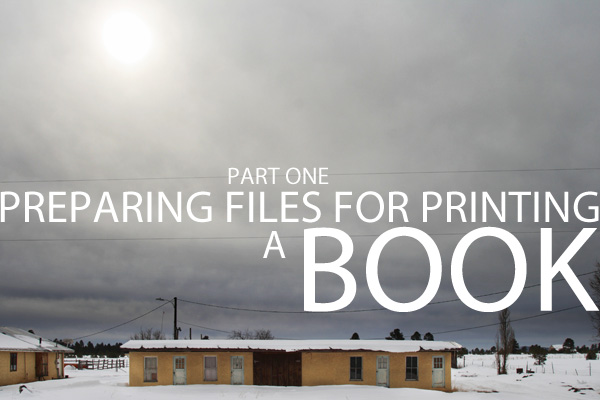
Image from my book on Northern Arizona, to be printed by Blurb.
Preparing the Digital File for Book Printing (Part One) by Jan Klier
(I am deep into the writing of my first book so there will be some wonderful posts by guests coming this month. It is nice to have friends who jump in and take up the reigns when things are tending toward overwhelming.)
Lots of us are excited about digital publishing. I have a small stack of Blurb and LuLu books on my coffee table, and more on the way. Photographers are finding that the quality of some of the “Print on Demand” publishers are well within the boundaries of what makes a pretty good book.
Some photographers are publishing books of images to simply enjoy, others are using the one-off books as leave behinds, and even drop-off portfolios. There are some incredible reasons to print books for marketing reasons, to be sure. And with most of the publishers, you can immediately begin selling on Amazon and other online booksellers.
Some popular book publishing companies include iPhoto, Blurb, LuLu, MyPublisher, and more.
I have published books with Blurb, LuLu and MyPublisher and have been very pleased by each of the books I have received. I will continue to publish with all of these companies using each for what I think they work best for. I am publishing the workbook at LuLu, a second book of Poetry by Jeanne Newhall (featuring my iPhone photographs) will be printed at Blurb, and MyPublisher will do a book of portraits for a friend of mine.
I know there are many others out there, but these are the ones I know and use. Happy to look at any others and their omission does not mean we don’t like them, only that we have not used them. Please feel free to add on-demand-printers that you have used and liked in the comments.
I am also not speaking of the more expensive wedding and coffee table book publishers like Graphistudio, Asuka, and Couturebook. These high quality printers have price points that make them more applicable to wedding and portrait books. I have printed with all of them, and currently have a new Graphistudio book on the way back. I will also be doing a Couturebook for a drop-off portfolio.
Most of the publishers have software that can make creating a book very easy. I prefer Photoshop and InDesign for my work, but that is probably due more to my experience with those programs than an absolute preference. The Blurb software is quite easy to use as is the MyPublisher. I haven’t tried LuLu’s yet, preferring to sent print ready PDF’s out of InDesign.
If you haven’t yet published a set of your images into a hard cover book, you should. Most of the book publishers have a 20 page minimum, and I like to print around 40 pages for a hard cover book. Some of my favorites are the large sized books available at Blurb and MyPublisher as well as the smaller, square format books at all three.
Workshop News:
Cincinnati in less than two weeks. I will be speaking at MPEX (Midwest Photo Exchange) in Columbus, Ohio on Monday evening, October, 11. 5:30 should be a good time to arrive. If you are in the area, we have only 2 spots open for the workshop. It will be held at the Red Door Studio in the Cincinnati area.
Norfolk, VA and Raleigh, NC are going to be great. We have people on the ground there working to get them to be a wonderful experience for the attendees. I can say that these weekends are going to be very powerful photographic experiences for all involved.
By the way, the winner of our first Big Lighting Essentials Contest was Rasheid Scarlett (Washington DC). Rasheid will be joining us at the Norfolk workshop as part of his winning loot!
A special shout out to the Apogee members, a small Flickr group I belong to. They have been and are being very supportive of my stuff. I am deep into writing a book at the moment, so they are coming to the rescue with some articles for LE. This allows me to keep focused on the book. It is my first so I imagine the editor will be kicking my butt and I want to make sure I have a lot of time for rewrites… heh. This article by Jan will allow me to keep on typing and shooting for the book. Thanks Jan.
 |
 |
 |
Let’s get on to Jan Klier’s article on preparing files for printing a book. This is part one.
Article by Jan Klier
With digital cameras, websites, online magazines, blogs, Facebook, Twitter – so many images live their entire life in electronic format. The constraints and techniques to reproducing the images in physical form aren’t being practiced much anymore. As a result many printing service cater to this trend by accepting images in RGB format and taking it from there – with mixed results.
That’s all good and convenient if you just need a quick print. The portrait photographer still delivers much of his product as a print, and has a wide choice of very capable photo printers to choose from. But if you cater to a commercial clientele, or if you print books, promo materials, or even just business cards printed on presses, then it’s a good idea to dive into the techniques of proper press-prep. Even if you just do a headshot, your client may get it printed that way even if you’re not directly involved. It can be considered an integral part of the craftsmanship of a commercial photographer, just like shooting to a layout that keeps the image’s use in mind.
I recently printed a new book and new promo materials and will use these as illustration for the process. There are several components that we’ll look into: color selection, soft proofing, test prints, CMYK conversion, and file prep. I use Photoshop and InDesign for my work, but most of this will also apply to other software available out there.
Once you know where you will be printing your materials you need to do some research. At a minimum you want to find the ICC profile for your printer’s press. Most reputable printers will publish this somewhere on their website. I’m currently relying on Modern Postcard for my small printing needs and Blurb for the book printing needs. I have been very satisfied on my recent print jobs. Most printers will also provide templates for the various software such as InDesign that includes the trim and safety guides. Modern Postcard has all their info posted here. Ideally you also want to get more information about their press performance (more during CMYK conversion). That isn’t always published, but you can ask their customer support if it’s not published and they may be able to help.
Color Selection & Soft Proofing
There are entire books written about color management, going way beyond what I can recap here. A really good detailed handbook is Dan Margulis’ Professional Photoshop. You should get a copy of this if you intend to study this topic in more detail. His companion book about Lab color is also a treat for those who enjoy advanced retouching.
What we do need to know is that our camera and our monitor can handle colors that will not print. With so many of the images being handled on our computer, we often end up with some that are much richer in color than what can be printed. This first step is to make sure that the colors we have can actually print the way we intend them or how we saw them. Keep in mind that the capabilities of each printer are different, so this process will be done with a specific printer in mind. That’s what the ICC profile is for – it describes in full detail what colors a printer can handle.
Photoshop has functionality specifically designed to facilitate this process. If you were able to obtain your printer’s profile, you want to make sure it is loaded into Photoshop. You only need to do this once per printer. Go to ‘View’ and ‘Proof Setup’, select ‘Custom’ and ‘Load’ to load your ICC profile into Photoshop and give it a proper name. Keep in mind that a printer might use multiple presses, so pick the right one. Once your profile is loaded, you want to make sure it has the checkmark next to it under ‘View’ / ‘Proof Setup’. Next you want to select ‘Proof Colors’ in the ‘View’ menu. Your image will change in feel, most likely it will look a lot flatter. This is Photoshop’s attempt to simulate your printer’s colors. Keep in mind that this is still a monitor display of a printer reproduction, so it’s closer but not quite the same yet.
The next step is where a lot of the work happens – one more time in the ‘View’ menu click on ‘Gamut Warning’ and tell Photoshop to mark colors that your printer will be unable to handle. If that is the case, Photoshop will overlay individual pixels (often entire regions) with a colored mask. That mask is red by default, but that color can be changed in the preferences dialog to a color that stands out clearly (hard to spot a red mask on an image with a lot or red in it). Every pixel that is out of gamut (marked in the overlay) cannot be printed in that exact color by your printer. If you leave it as is, the printer will use various techniques to deal with it and will print some color. You could leave it up to the printer to do a best effort, but it may not be exactly what you saw. It’s a question of how much control you want to have on the outcome of your final image. If you’re still reading, I assume you do care and won’t leave it to the software to do best effort.
Now what? Well, that depends on where the colors come from that are troublesome. If your print is a photo and your subject had a very colorful shirt on, you will have to selectively fix the troublesome colors. Usually it’s the most saturated colors that are difficult for the printer. The simplest fix is to add a vibrance adjustment layer and reduce the vibrance until all the gamut warnings disappear. Most likely by the time they’re all gone, your image has lost much of its color – it was the sledge hammer approach to fixing it. A better way is to add a mask to the vibrance layer and then paint at lower opacity into that mask, gradually and selectively reducing vibrance in problem areas only, making sure that the transitions still work. In some areas a single stroke at 10% or 20% will be sufficient. In other areas you may have to take several strokes before the problem is fixed. If you have a good command of the color and it’s components, you may also be able to do localized curves adjustments of individual channels instead of just reducing vibrance.
At other times it may be a logo that is the issue. The last print of my book was the first one with my new logo which has some very strong orange in it. It was way out of gamut for the printer. In that case, because it wasn’t a photo but a vector graphic, I had the chance to just change the color altogether. But which color to choose? We can play trial and error. Better yet, Photoshop actually provides us a good tool to hand-pick workable colors and making the trade-off between feel and printability a design choice.
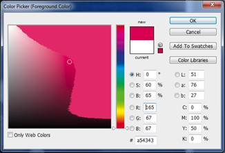
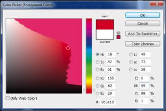
With the color proof setup in place, if you go into the color picker dialog in Photoshop it actually will apply the same overlay mask in the color field and show what is out of gamut. With that you can move the color picker right up to the edge of what your printer is capable of. This is a good time to understand all the different color spaces (RGB, HSB, Lab, CMYK). With that information, you will follow that the gradient on the left has saturation on the x-axis, brightness on the y-axis, while hue is on the slider to the right (or in the numeric fields of the HSB values). In the first example I picked the brightest and most saturated pink the printer could do (top right corner of the printable color range. By moving the hue you might be able to find more saturated values. The second example shows a color picker with a slightly shifted hue. You can experiment by either moving through different hues, or by entering different ink combinations. The HSB and CMYK color spaces are much more intuitive on that front than RGB.
OK, so where are we now? We now do have a file that consists entirely of colors that your designated printer can reproduce accurately. And you have a preliminary view of how your image will reproduce on screen.
Test Prints
But light emitting displays like your monitor still look much brighter than what your print will look like. If you have optimal conditions (few of us do, nor will the end consumer of the image) you would have your monitors brightness calibrated and dialed down, and you would be viewing your prints in a special viewing booth with optimal lighting conditions and the two would indeed appear identical next to each other.
Forgoing optimal conditions for reality, it’s best to create a test print of your image to get a feel for how the image looks on paper. For that reason it’s helpful to have a decent photo printer of the smaller variety. Even if I get my prints done at Modern Postcard or Blurb, I will take a few images and print them on my Epson 4880 on a 8.5×11 photo paper to get a feel. The Epson printer’s color characteristics are quite different than the press, so what I’m looking for here is less color accuracy but more tonal appearance as a print. You will often find that your print looks darker than you expected. A curves adjustment layer that pulls up the upper mid-tones is a good way of addressing that. That preservers the tonal range of the image, but improves the overall appearance on a passive display surface.
Thanks Jan. We will publish part two on Friday Morning, so watch for it. Visit Jan’s site to and his blog. I will also have a PDF of this entire document at that time. You will be able to download it and use it as a roadmap for preparing your next book.
As always, follow me on Twitter, and visit the workshop page at Learn to Light for information on workshops.

