LIGHTING PRINCIPLE THREE: THE COLOR OF LIGHT
We see light usually as a white source, or at least a neutral source.
It isn’t. neutral, it has a color to it and that color can influence all the parts of your image, from shadows to highlights. We don’t see the color of light because our brain changes it to a neutral “white” color as we see it.
Here is a wonderful article that explains the way that the color of light affects your image. Read it now.
When we look at the color of the scene in front of us we can change it globally by changing our color balance in the camera, or using a filter. What “globally’ means is that everything in the photo is changed to the same setting. All the colors are altered by this global change to the color of the light.
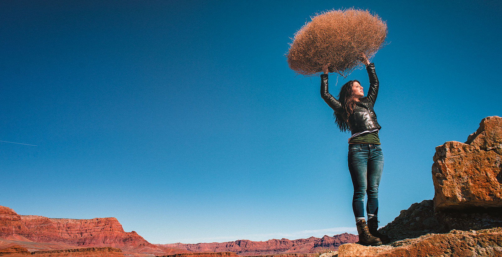
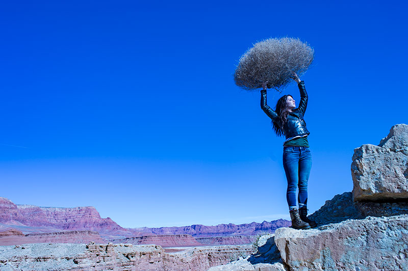
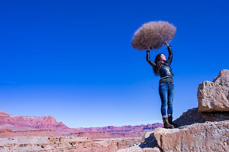
On the left is a photograph taken near Mable Canyon. The sun was quite bright, and there was a bit of warmth to the image because of all the warm browns and oranges of the topography all around us.
This image is as shot. I have applied global changes to the color of the light source so you can see what that does to the image.
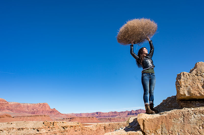
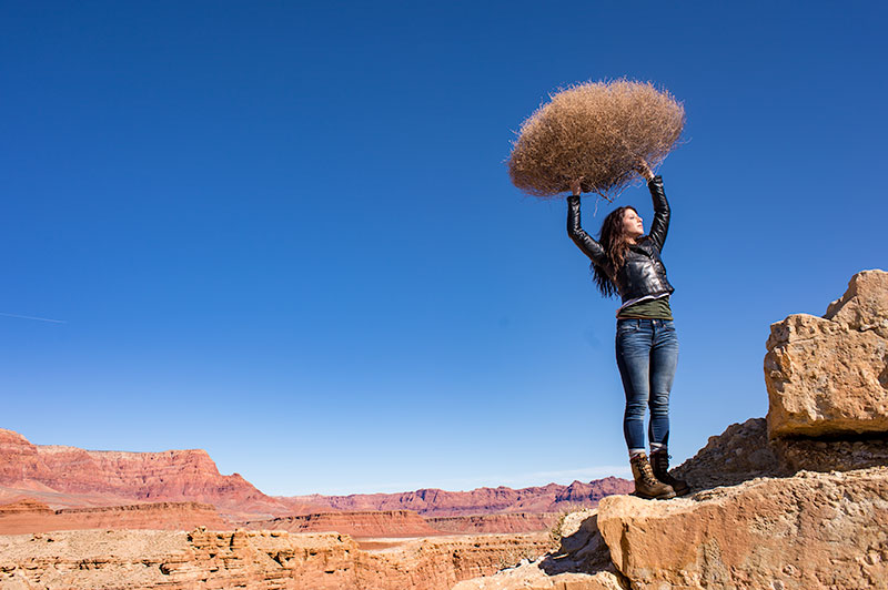
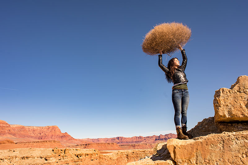
Below from left to right:
Daylight / Shade / Tungsten / Flourescent
DAYLIGHT
Changing from As Shot to Daylight shows very little difference, although the daylight color balance makes it a bit more warm.
SHADE
Since the color of the light in the shade is a bit more blue, we add some warmth to the overall image to compensate for it. In this shot you can see the global warmth is not going to work because the image was not shot in the shade.
TUNGSTEN
Tungsten light is very orange, so when we apply a tungsten color balance to a shot that is not too orange, we get this very blue looking shot. This is a good reminder of just how ‘warm’ tungsten light is if it takes this much blue to make it correct.
FLUORESCENT
Fluorescent light is blue/green so it makes it difficult to compensate for. In this application of the fluorescent color balance, we can see the sky going a deep blue, while the desert mountains behind become more magenta.
LOCAL LIGHT SOURCE MATCHED TO AMBIENT
Working with a secondary light source that may be a different color presents us with a challenge. We cannot change the image globally because adding a correction to the image to correct for the different light source will affect the entire image.
We must then change the different light source to the ambient (or overwhelming light) in order to ‘balance’ the subject in the ambient setting.
The ambient setting is the overwhelming light that we usually cannot change: the sun, a large warehouse, a home. Bringing in our own lights means we must know how to match what we bring to what is there.
ASSIGNMENTS FOR THIS CLASS:
- Using the color settings on your camera, take the same image with each of them. Shoot with Daylight, Shade, Tungsten, Flourescent at least and do this in places where those colors exist. In other words, shoot some images outside, inside with regular household lamps, and some place that has Flourescent. (NOTE: Many big box stores use a light source known as Mercury Vapor. Mercury Vapor is blue/green so it is very difficult to adequately address. We can add magenta to offset the green, but that turns the blue part of the light to purple. If we address the blue with something warm, we add that to the green part of the light.For Mercury Vapor correction, try “auto” on your camera setting. It is the best I have found for correcting most of that blue/green color shift.
- Using a strobe (speedlight), take a photograph of someone while the sun is going down behind them. Do not alter the strobe setting, just let it keep making the shot as the light turns warmer and warmer. You will then see how “blue” the light source seems coming from the flash.You may have to change the settings as the light gets dimmer, but I think you will see the changes pretty well.
We will be addressing color balance in all of the upcoming classes.
01: Lighting Class: Light Principle One: The Size of the Light Source
Let's look at light and the four principles of how light works. First up, the size of the light source in relation to the size of the subject. Imagine looking out the window at the front yard and without seeing the sky knowing whether it is sunny or cloudy. We do...
02: Lighting Class: Light Principle Two: The Distance of the Light Source
DISTANCE OF THE LIGHT SOURCE FROM THE SUBJECT The second principle of light is the distance of the light source from the subject. One thing for sure, if it is artificial light, the distance of the light source from the subject can change the size relationship, but...

04: Lighting Principle Four: Angle of the Light Source to Subject / Camera
Lighting Principle Number Four: The Angle of the Light to the Subject and the Camera Law of Physics: Angle of Incidence equals the Angle of Reflection. This is an axiom that a lot of people hear and repeat without taking careful note of what it means to their...
05: Subject Properties: Part One
EVERYTHING REFLECTS. Let me say that again. Everything reflects. Some things reflect more than others. Some surfaces are more reflective than others. But since everything reflects, we are sometimes presenting what that subject reflects rather than ‘bouncing’ light...
06: Subject Properties: Part Two
Matte Surfaces These are surfaces that are not as rough as texture, but not smooth either. Skin, cloth, natural leather, finished woods and many food items are examples. Most of what we deal with in our daily lives would fall under the Matte surface example. Matte...

07: Subject Properties: Part Three
Shiny or Glossy surfaces: The third of our major surface efficiencies is glossy or very shiny surfaces. The complete opposite of the textured surface, the glossy surface will record the reflection of the light source absolutely. That means we have to be very careful...
08: Controlling The “Presentation of Light”
Subject Centric Lighting: The Five Areas of Light Presentation Cover image by Project 52 student, Gabriel Alvarez. When the lighting choices we have made are used, the light is 'presented' back to the camera in expected, and controlled ways. There are five parts of...
Arc of Beauty: Side to Back Lighting
Have You Considered the "Arc of Beauty" in your lighting? (Image by Tracy Sutherland) We are going to take a high-level view of lighting today and discuss what I call the "Arc of Beauty". And while no lighting scheme is going to be directly discussed, what we are to...
